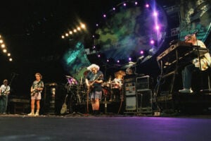
Photo: Jean-Luc Ourlin / CC BY-SA (https://creativecommons.org/licenses/by-sa/2.0)
Over the course of their career, The Who have embodied rock ‘n’ roll in both its rawest form as well as its most complex. Cover artwork for their albums have been no less interesting an assortment. Illustrated concepts have ranged from one which involved hiring sixteen – count ‘em sixteen – top British artists to another which utilized a single cartoonist for whom they didn’t exactly have to look very far (he was in the band). Photo-based covers have sometimes been simple group shots, but probably their best-known is like nothing that had come before (or since), yet has earned itself at least one surprising detractor.
Here are our choices for the top ten album covers by The Who, along with the stories behind them.
# 10 – Who Are You

![]()
As they were returning after a three year absence – and to a world where disco dominated the charts and the punk movement vowed to bring down rock’s old guard – we might make an educated guess that The Who wanted to reintroduce themselves in as straightforward a manner as possible on their 1978 release, which is why Who Are You was the band’s first album since My Generation to feature a simple group shot on the cover. But it might not have been quite that calculated: The picture came from a spur-of-the-moment shoot on May 28, 1978, when the band was performing a short live set at Shepperton Studios in London to be filmed for the upcoming feature The Kids Are Alright.
Also, no practical idea for the cover had been presented by the one originally commissioned to deliver it: Keith Moon. It was the drummer’s turn in the rotation of members to conceive the album cover artwork, but nothing on his part was done with the opportunity. Moon – who appears visibly heavier on the cover, an explicit sign of his deteriorating health – died less than four months later (ironically, the chair he’s sitting on in the photo is clearly marked “NOT TO BE TAKEN AWAY.” If only).
# 9 – Hooligans

![]()
In the wake of countless Who compilations which have been released since, this double album collection released in 1981, which focuses mainly on their Seventies output, has largely fallen by the wayside. But that, in fact, may just be the theme of the underrated cover design by Richard Evans: in the lot in front of (what appears to us like) a British apartment complex, it looks like the aftermath of either a riot or a party (in rock ‘n’ roll sometimes it’s hard to tell).
A few of the discarded items lying on the ground tell a story: an abandoned drum cymbal and the remains of a smashed guitar are pretty obvious, but the TV set that looks like it’s burrowed part way into the ground is likely a reference to late drummer Keith Moon’s calamitous hobby of throwing sets out of hotel room windows. The fact that this TV not only seemed to have survived, but is broadcasting an image of the band, perhaps is meant to convey that The Who’s music can and will survive just about anything as well (the fence/music notation across the bottom of the cover is another compelling and innovative touch).
# 8 – The Kids Are Alright

![]()
Though actually taken in 1968, this group shot became probably the last defining Who image of the Keith Moon era after being used for the poster of the 1979 feature documentary The Kids Are Alright, as well as the accompanying soundtrack. Although the four members are covering themselves with a Union Jack (a common sight in the band’s imagery), the picture was actually taken in New York City by photographer Art Kane, originally for a Life magazine article. There’s always been some speculation that the image is meant to be homage to a Henri Cartier-Bresson photo which shows a homeless man sleeping in public. Some accounts have also claimed that the four members of the band weren’t playing possum: rather, tuckered out from their highly demanding schedule, the lads simply nodded off. Awwwww……
# 7 – Face Dances

![]()
Face Dances, the Who’s 1981 studio release (and also the first without Keith Moon), features possibly the most elaborate cover in the band’s catalog. This is probably not surprising given that it was designed by Peter Blake, who had previously orchestrated the game-changing artwork for the Beatles’ Sgt. Pepper’s Lonely Hearts Club Band. But Face Dances, which features four face portraits (hence the title) of each of the four members of The Who (including new drummer Kenny Jones), took the combined effort of sixteen top British artists, including David Hockney, Colin Self, Richard Hamilton and Clive Barker (no, not that one). The final result sort of invokes an art gallery, and early pressing of the record even came with a fold-out poster reproduction.
# 6 – Meaty Beaty Big and Bouncy

![]()
Released in 1971, Meaty Beaty Big and Bouncy was already the Who’s third commercially issued best-of record, but it’s still considered to be probably the essential single-LP collection of the their pre–Who’s Next output. Originally meant to be titled The Who Look Back, the use of the brown-tinted black and white photography and the image of the four small boys are possibly meant to reflect the fact that by 1971 pop culture phenomena closely associated with the Who like mod scene and the original British invasion were already seen as nostalgia.
The four small boys picture is neither a stock image nor is it an actual photo of the four members of the band in their younger years (despite what’s probably widespread assumption and/or wishful thinking, as they didn’t meet until their teens). Rather, the photo taken by Graham Hughes was staged to emulate The Who as children (one of the boys is Paul Curbishley, the younger brother of Who manager Bill Curbishley). Of course, in the upper left hand corner those are the actual band members looking out the window, in contrasting full color.
# 5 – The Who By Numbers

![]()
Not merely content to be one of rock’s all-time greatest bass players, John Entwistle showed the world his hidden talents as a cartoonist with his cover design (complete with bold signature) for the band’s 1975 studio album The Who By Numbers, which featured caricatures of himself and the three other members as a connect-the-dots puzzle (okay, let’s all be honest – how many people took a pen to the album cover and completed it?). But it might not have been all fun and games: By Numbers is a collection of deeply personal songs which address alcoholism, feelings of isolation and the mixed blessing of rock stardom (among other topics), so it could be said that the cover also represents the idea that these four successful musicians, now facing age thirty, were still trying to connect all the dots in their lives.
# 4 –Tommy

The visuals which most people probably now associate with the Who’s rock opera Tommy are those which derive from Ken Russell’s popular 1975 film adaptation. While the cover artwork by Mike McInnerney for the original 1968 album is nowhere near as elaborate, it nonetheless successfully incorporates numerous themes into a brilliant duel image, where an illustration of birds flying in a clear blue sky with white fluffy clouds is contrasted against photos of the band members appearing to be “trapped” and trying to reach out (probably meaning to invoke the album’s song “Go to the Mirror!”).
It’s also presented as an optical illusion, where which imagine is dominant depends upon how you look at it (in every sense of the term). Some – including guitarist/songwriter Pete Townshend – have suggested this cover artwork is clearly a product of the psychedelic era… but in many ways so is the album, yet both have proven to be timeless.
# 3– Quadrophenia

![]()
The cover for The Who’s rock opera about the mid-Sixties mod experience features one such individual (presumably meant to be Jimmy, the story’s protagonist) on a scooter (their preferred mode of transportation). The photo by Graham Hughes and overall design are pretty brilliant, perfectly representing the album’s themes with the central figure facing away from the camera (to illustrate his feelings of isolation) and the use of grey tones (representing both the grey area that Jimmy’s life is, as well as abundance of rain which typically falls in England).
As perfect a reputation of the album as the main image is, lead singer Roger Daltrey apparently wanted the band members’ likeness to also have some representation on the cover, thus each of them appear in one of the scooter’s real view mirrors (essentially “hidden,” the same way they were on the cover of Tommy).
# 2 – The Who Sell Out

If you’re not familiar with the story behind this cover, then you don’t know beans (sorry, we couldn’t resist). The Who’s third full-length album saw each of the four members satirizing celebrity commercial endorsement complete with meandering ad copy including Roger Daltrey as spokesman for Heinz Baked Beans (the only real product being hawked here).
This called for the singer to sit in a bathtub full of ‘em, and getting the photo apparently wasn’t just messy: the beans had come directly out of refrigeration, which meant that they were ice cold at the beginning of the forty-five minutes which Daltrey would be required to sit in them. He would later say he contracted pneumonia as a result, although Townshend has openly questioned that claim (either way, we’re sure it was uncomfortable).
Of course, it’s impossible to discuss this album cover without bringing up the irony that in the early Eighties the Who appeared in several TV commercials for Schlitz Beer (after becoming one of the first bands ever to accept corporate tour sponsorship), and since then Townshend has regularly allowed the band’s songs to be used for advertising (we can look at it this way: if we’ve got to be subjected to advertising, we’d rather hear a few seconds of a Who classic than some wussy jingle).
# 1 – Who’s Next

![]()
“[A] piece of sh*t. I hate it. It’s a horrible thing. Just horrible. Of course I don’t like it. It’s got no artistic consequence whatsoever… It’s meaningless.” Just who is this describing the iconic cover of the Who’s 1971 masterpiece Who’s Next? Some overprotective anti-rock parent? A self-appointed media watchdog? Some disgruntled music or art critic? Or just your garden–variety hater? It’s none other than Pete Townshend himself, explicitly conveying his obviously distain to Entertainment Weekly’s website in 2019.
We’re going to respectfully disagree. The photo taken by Ethan Russell, which shows the four band members having just finished urinating on a massive slab planted in the ground in the middle of nowhere (actually Easington Colliery in the UK), is a perfect statement which at once conveys nothing, everything, or just what you want it to. The “sky” was added to make the photo seem “otherworldly” (possibly a link to Lifehouse, Townshend’s dystopian concept that this album was originally intended to be). Speaking of science fiction, the slab itself was a reference to the then-recent movie 2001: A Space Odyssey (of which the Who were fans, despite what this seems to implicate). Three of the urine stains are actually water, since apparently at the shoot only Pete Townshend legitimately pissed on the slab. As suggested by the quote above, he’s since taken similar aim at the idea of this cover. But we still like it.
Check out Mr. Cummins’ great books he authored available at Amazon entitled:
Name, Rank, Rock ‘n’ Roll: Famous Musicians Who Served in the Military

![]()