Feature Photo: Andrea Raffin / Shutterstock.com
Our Top 10 Green Day Album Covers list will look at a popular rock band that formed in the 1980s and has sold over 75 million records worldwide. They are one of the world’s best-selling artists of all time. They have won 92 awards and counting. Two of their albums (Dookie and American Idiot) were voted as the greatest albums of all time. Dookie was voted as one of the best albums of all time on various music lists. There is a play based on their album American Idiot. The musical was nominated for three Tony Awards. Green Day was among the groups that helped popularize a renewed interest in punk rock in the United States. Green Day was inducted into the Rock and Roll Hall of Fame.
For musical artists, the album covers are the first impression they can make on their fans. They want to design the best artwork to attract the fans’ attention. There are a lot of choices out there so artists need their albums to stand out among the crowd. The photographers, artists and illustrators know that the covers are important to the artists so they have to do what they can to make their covers stand out. Green Day put a lot of effort into their album covers. Their album covers are shocking and unique. They will give you something to talk about. Our Top 10 Green Day Album Covers list will give you a chance to check out their various album covers.
# 10 – ¡Dos!

![]()
The first pick on our Top 10 Green Day Album Covers list is ¡Dos!. ¡Dos! is Green Day’s 10th studio album. This album is part of a trilogy Green Day did. This is the second installment in the trilogy. This album is the band’s take on garage rock music. The album is supposed to make you feel like you are at a party. The album cover features a black and white picture of Mike Dirnt. He is wearing a black shirt. His hair is spiked. His mouth is slightly open. There are pink X’s on his eyes. The X’s indicate that his eyes are cut out. He is standing in front of an orange neon background. There are stripes in the background. It looks as if they are trying to hypnotize you in the picture. The band’s name is written at the top of the cover in bold blue letters. The album title is written in bold white letters on the bottom left of the cover.
Chris Bilheimer got the idea to do this cover from lead singer Billie Joe Armstrong. Billie Joe Armstrong took the band’s picture on his phone. Billie Joe Armstrong put X’s over their eyes. Chris Bilheimer liked the idea. He listened to Green Day’s music and got inspired to create the background. The band didn’t want to do a big photo shoot. The band was going for a 60s garage vibe, but it became more of an 80s look. It was a good idea to give the band separate album covers because it gives them a chance to shine individually.
The album cover screams graffiti style artwork. It may look like an average cover, but it is pretty cool. Chris Bilheimer mixed color with black and white. Chris Bilheimer is an art director and designer. He has worked with Green Day, Foo Fighters, R.E.M., Daisy, Fiddlehead, Bad Religion, Joe Christmas, Whiskeytown, as well as others. ¡Dos! was released in November 2012. The album peaked at number three on the rock charts. The album features the single “Stray Heart.”
# 9 – ¡Tré!

![]()
The next pick on our Top 10 Green Day Album Covers list is ¡Tré!. ¡Tré! is Green Day’s 11th studio album. This is the third installment in the trilogy. The album title is a play on Tre Cool’s name. This album is about the things that happen after you are done with the party. It is the clean up after the party. This album has more stadium rock and has a bigger sound. It is a reflective album. Like our previous entry, the album cover features one member on the cover. Tre Cool is on the cover. He is standing in front of a blue neon background. He is wearing a black shirt. His hair is spiked. The picture is taken from his right side. He is standing on the right side of the cover. His eyes are open while his mouth is closed. He has pink X’s over his eyes. The band’s name is written in yellow green lettering on top of the album cover. The title is written in white lettering on the bottom left.
Chris Bilheimer used a different color for this background. He chose blue neon for this background. It was smart of Chris Bilheimer to change the color so the album covers wouldn’t be the same. It makes sense to use this color because you may feel blue after the party is over. If you have to clean up the mess, you are going to feel blue. Chris Bilheimer took a close shot of Tre Cool in this picture. It made sense to put Tre Cool on the third cover because his name is Tre. Chris Bilheimer used a nice shade of blue for the background. It matched the rest of the colors in the picture. ¡Tré! was released in December 2012. The album peaked at number 13 on Billboard 200 and number three on the rock charts. ¡Tré! features the singles “The Forgotten,” “X-Kid” and “Brutal Love.”
# 8 – ¡Uno!

![]()
The eighth pick on our Top 10 Green Day Album Covers list is ¡Uno!. ¡Uno! is Green Day’s ninth studio album. This is the first installment in the trilogy. This album stuck with the formula that made the band famous. Green Day wanted to spread their wings creatively with this trilogy. They wanted to make their album like AC/DC and early Beatles music. This album is what happens at the start of the party. The album cover features a black and white picture of Billie Joe Armstrong. He is standing on an angle with his head turned towards the right. His hair is spiked. His picture is taken from the neck up. His eyes are closed. He has pink X’s over his eyes. He is smiling in the picture. He is standing in front of a green neon background. The band’s name is written in pink letters. The album title is written in white letters.
Chris Bilheimer went to work on this picture just like he did with the other two album covers. He managed to make the same cover look different. He took a picture that captures the way you would feel when you go to a party. Most of us are excited to go and can’t wait to get the party started. This is the look he captured in the picture. Billie Joe Armstrong looks as if he is having fun in the picture. The picture is energetic which works for the theme of the album. Once Chris Bilheimer listened to the music for the albums, he knew what to do to create the looks for the trilogy. ¡Uno! was released in December 2012. The album peaked at number two on Billboard 200 and the rock charts. ¡Uno! features the singles “Oh Love,” “Kill the DJ,” “Let Yourself Go” and “Fell for You.” The album sold over one million copies.
# 7 – Warning

![]()
Coming in at number seven on our list is Warning. Warning is Green Day’s sixth album. The songs on the album are more optimistic than the ones on their previous albums. This album had a different sound from what the audience was used to from the band. The album cover features a black and white photo of the guys. The picture is taken from their left side. They are walking down the street. Billie Joe Armstrong is on the left looking down. Tre Cool is the one in the middle. He is looking to the right. Mike Dirnt is on the right. He is also looking to the right. He has his arms crossed. You can see buildings in the picture. The band’s name is written in bold green letters at the top of the cover. The album title is written in yellow letters at the bottom right of the cover.
This album cover captured a serious side to Green Day. They were trying to be more mature on this album. Marina Chavez and Chris Bilheimer took a different side of the guys. They didn’t use imagery or special effects for the picture. It is just a picture of the guys walking down the street. They took care of the band and made sure they looked good in the picture. The black and white made the picture look powerful. It added to the somberness of the picture. It makes you wonder why they look so sullen and depressed in the picture. Marina Chavez is a photographer who has worked with Green Day, Red Hot Chili Peppers, The Jayhawks, Hurricane, Dogstar, Brendan Lynch, No Authority, Fear Factor, Whiskeytown, Hanson, Chopper One, Yellowjackets, Depeche Mode, Simon Says, Rob Zombie, as well as others. Warning was released in October 2000. The album peaked at number four on Billboard 200. Warning features the singles “Minority,” “Warning” and “Waiting.” The album sold over one million copies.
# 6 – Revolution Radio

![]()
Revolution Radio is Green Day’s 12th studio album. The band took time off to regroup and get the juices flowing. They were ready to attract a new audience. Green Day talked about what was going on in America politically and socially. The album cover features a picture of a burning boombox. The flame is coming from inside the radio. The radio is in front of a black background. There is smoke going towards the left of the album cover. The band’s name and album title doesn’t appear on the album cover. There is no writing on the album cover. It is just a picture of a radio on fire.
Frank Maddix and Nick Spano took an unusual picture for the album cover. There is a lot of darkness in the picture. The only source of light is the flame coming from the radio. Is it supposed to be symbolic of something? Does it mean that radio is dying? Does it mean radio is about to go up in flames? Why is the flame only coming from inside the speakers? The picture will leave you with different questions. The band chose not to appear on the album cover. They also didn’t use cartoon images for the cover. They took a risk not having their name featured on the cover.
There is no indication that this album is Green Day’s. This album cover would look great on a T-shirt or make a great tattoo. Frank Maddix is a photographer, graphic artist and designer. He has worked with Green Day, Linkin Park, Gary Clark Jr., Atlas Genius, Slash, Deftones, as well as others. Nick Spano is a photographer who has worked with Green Day, Amanda, Michelle Branch, Unloco, Deftones, Linkin Park,, Tyler Hilton, Paulina Rubio, Clear Static, MoZella, Madonna, Elliott Yamin, The Wreckers, as well as others. Revolution Radio was released in October 2016. The album peaked at number one on Billboard 200. Revolution Radio features the singles “Bang Bang,” “Still Breathing” and “Revolution Radio.” The album sold over 600,000 copies.
# 5 – 21st Century Breakdown

![]()
The next pick on our Top 10 Green Day Album Covers list is 21st Century Breakdown. 21st Century Breakdown is Green Day’s eighth studio album. This album is a rock opera. The album is about the band trying to make sense of everything that is going on around them. They talk about the media, religion, government and any type of authority. The album cover is a stenciled picture of a couple kissing. The couple is hugging each other while kissing. The female has her arms on his shoulders while the male has his arms wrapped around her. The picture is taken from his left and her right. They are standing in front of a brick wall. The wall has graffiti spray painted on it. The band’s name is written in white graffiti letters. The ‘r’ in Green Day has an X on it. The album title is written in yellow graffiti letters.
Chris Bilheimer was inspired to design the cover based on graffiti artist Sixten’s picture. Chris Bilheimer put his own spin on the picture. He created a couple who looked like they are in love. He used a good blend of light and dark colors. He used graphic art instead of a photograph for the album cover. This looks like something from a comic book. It is not an over-the-top picture. It is a picture that features a couple who are in love. The picture is something male and females can enjoy looking at while they are listening to the music. 21st Century Breakdown was released in May 2009. The album peaked at number one on Billboard 200 and the rock charts. 21st Century Breakdown features the singles “Know Your Enemy,” “21 Guns,” “East Jesus Nowhere,” “21st Century Breakdown” and “Last of the American Girls.” The album sold over one million copies.
# 4 – Nimrod
![]()
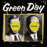
Nimrod is Green Day’s fifth studio album. This album shows the band’s diversity. They talk about maturity, reflection and fatherhood on this album. The band shows their vulnerability on this album. The album cover is a black and white picture of two men. The men are wearing suits. The word “nimrod” is in a yellow circle in front of their faces. The yellow circles block the men’s faces. The pictures resemble a newspaper clipping or pictures from a yearbook. The men’s pictures are placed side by side. Their pictures are taken from the front. There is a beige border around the pictures. Letters are visible in the beige background. There is visible wear and tear on the pictures. The pictures are on a black background. The band’s name is featured on top of the cover in white letters.
The band got the title from the Biblical figure named Nimrod. People thought it was a bad thing to be called a nimrod, but it is not. Chris Bilheimer took pictures of scientists and used them for the album cover. He had the idea to destroy the pictures and used the album title to conceal their identities. The band used this idea to discover who they were musically. Green Day wanted the album cover to resemble the yearbook pictures you wanted to destroy in high school. Chris Bilheimer gave them what they wanted. This album cover is a great conversation piece as you wonder who is behind the “nimrod” label on the cover. It may inspire you to look in your yearbook and do the same thing. Nimrod was released in October 1997. The album peaked at number 10 on Billboard 200. Nimrod features the singles “Hitchin’ a Ride,” “Good Riddance (Time of Your Life),” “Redundant” and “Nice Guys Finish Last.” The album sold over two million copies.
# 3 – Insomniac

![]()
Coming in at number three on our list is Insomniac. Insomniac is Green Day’s fourth studio album. This album had a harder sound than their previous albums. The album discusses alienation, boredom, anxiety and addiction. This album gave the band a chance to show off their dark lyrical side. The album cover is a collage of different pictures. There is a picture of a woman holding a guitar. She has blonde hair and is wearing a red and white dress. There is someone playing the violin. There is an X-ray machine in front of them. You can see the inside of the person’s rib cage. The person has a Phoroptor Machine in front of their eyes. There is a skull on a table. There is also a shot of a woman wearing a pink glove and white dress. She has her hand on her head. The woman is cut off in the picture. You can see flames in the background. The band’s name is written in white letters on the top left of the album cover. The album title is written in black letters.
Green Day wanted Winston Smith to do their album cover. Winston Smith painted an interesting picture. He painted different types of people for the album cover. There aren’t too many people who would create an image of getting an eye examination while playing the violin. They also wouldn’t be getting a chest X-ray while playing the violin. Winston Smith gets an A for creativity. The picture may leave you scratching your head wondering what is going on in the picture. The picture will leave you speechless. We could see something like this hanging up in a museum or art gallery.
There is plenty to admire while you are listening to Insomniac. Winston Smith is a designer and an artist. He is known for doing collages. He has worked with Green Day, Dead Kennedys, The Beatings, Lard, Parasites, War Zone, The Leaving Trains, Ben Harper and the Relentless 7, Executioner, as well as others. Insomniac was released in October 1995. The album peaked at number two on Billboard 200. Insomniac features the singles “Geek Stink Breath, “Stuck with Me,” “Brain Stew” and “Jaded.” The album sold over two million copies.
# 2 – American Idiot

![]()
American Idiot is Green Day’s seventh studio album. This album is considered a punk opera by the band. The album follows the story of an American adolescent anti-hero. The album talked about what happened to people during the Terrorist attacks and the Iraq War. The album cover features an illustration of a left hand holding a bloody grenade. The grenade is shaped like a heart. The grenade hasn’t been detonated. There is blood coming down the hand. The band’s name is written in big white letters on the left side of the album cover. The album title is written in blood-red letters. The hand is on a black background.
Chris Bilheimer came up with a design for the cover by listening to one of their songs. He got the idea when he heard the song “She’s a Rebel.” The lyrics are, “she’s holding on my heart like a hand grenade.” He found a great way to convey that lyric into a picture. It was a wise choice because it fits with the theme of the album. The album cover makes an emotional and political statement. He used red, white and black for the imagery which was a great touch. The blood dripping down the hand was a great special effect. It gives the picture a sinister look. This looks like the cover of a movie poster instead of an album cover. American Idiot was released in September 2004. The album peaked at number one on Billboard 200. American Idiot features the singles “American Idiot,” “Boulevard of Broken Dreams,” “Holiday,” “Wake Me Up When September Ends” and “Jesus of Suburbia.” The album sold over six million copies.
# 1 – Dookie

![]()
The number one pick on our Top 10 Green Day Album Covers list is Dookie. Dookie is Green Day’s third studio album. This is the band’s breakout album. It helped them get more tours and money. The album is about anxiety, relationships and sexuality. This is one of the breakthrough albums of the 90s. The album cover is a cartoon illustration. The album cover is very busy. It has individual characters doing a variety of things. There are dogs throwing bombs and dirt at people. There is a monkey on the cover. There is a blimp in the sky. There are planes flying in the air. There is a man with a camera. There is a person dressed like the Mona Lisa. There are several people on the album cover. The band is featured on the album cover. There is a mushroom exploding in the middle of the picture. The band’s name is coming out of the explosion. The album title is at the bottom of the cover. There is a lot going on in this picture.
The album cover looks like the cover of Mad Magazine. Green Day wanted something different for this album. They wanted it to represent East Bay. They felt that the artists from East Bay are just as important as the music. They went to Richie Bucher and asked him to do their cover. Richie Bucher worked with a band called Raooul. Billie Joe Armstrong liked what Richie Bucher did for their album cover and wanted him to work with them. Richie Bucher did a fantastic job with the illustration. He drew everything in detail. He has everything you could imagine on this album cover.
He used notebook style sketching to do this cover. He didn’t have any formula for the cover. He did a freestyle picture for the cover and it works. This is one of the band’s most iconic album covers. It is not a surprise that it is one of their most memorable covers because there is a lot going on in it. You will have a lot to look at while you are listening to the music. It will be fun to look at the different pictures. Dookie was released in February 1994. The album peaked at number two on Billboard 200. Dookie features the singles “Longview,” “Welcome to Paradise,” “Basket Case” and “When I Come Around.” The album sold over 10 million copies.
Top 10 Green Day Album Covers article published on Classic RockHistory.com© 2023
Classicrockhistory.com claims ownership of all its original content and Intellectual property under United States Copyright laws and those of all other foreign countries. No one person, business, or organization is allowed to re-publish any of our original content anywhere on the web or in print without our permission. All photos used are either public domain creative commons photos or licensed officially from Shutterstock under license with ClassicRockHistory.com. All photo credits have been placed at the end of the article. Album Cover Photos are affiliate links and the property of Amazon and are stored on the Amazon server. Any theft of our content will be met with swift legal action against the infringing websites.
![]()