Feature Photo: Nicolas Lœuillet, CC BY-SA 2.0 <https://creativecommons.org/licenses/by-sa/2.0>, via Wikimedia Commons
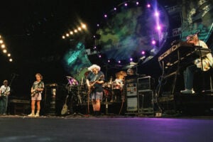
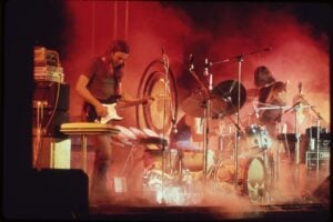
Our Top 10 Radiohead Album Covers list will look at an English band who formed in 1985. Radiohead are innovators of alternative rock music. Their music helped make alternative rock music more popular. The band has sold over 30 million albums worldwide. Their third album OK Computer helped them gain international fame. They have won over 40 awards and have been nominated for over 90 awards. They have been voted as one of the greatest acts of all time. They have been inducted into the Rock and Roll Hall of Fame. Several of their singles have charted on Top 40 in the United Kingdom as well as the United States.
Radiohead are known for their artistic creativity. They wanted that creativity to be displayed on their album covers. They didn’t use headshots of themselves on their album covers. They used different pictures to represent their sound. You didn’t know what to expect from their music as well as their album covers. The photographers behind the album covers picked the right look to represent the band. They are not an ordinary band so they couldn’t have ordinary covers. No one could ever accuse them of having boring artwork. Come see which album covers made our Top 10 Radiohead Album Covers list. You will see how different each album cover is.
# 10 – Radiohead: The Best Of

![]()
The first pick on our Top 10 Radiohead Album Covers list is Radiohead: The Best Of. Radiohead: The Best Of is Radiohead’s second compilation album. This compilation album features songs from their first six albums. The group wasn’t happy about this project. The album cover features two cartoon characters shaking hands. The shot is taken from the profile. You can’t make out any features on their faces. The cartoon character on the right is holding a briefcase. The character on the left has light colors painted on the body while the character on the right has dark and light colors painted on the body. They are standing in front of a black background. There is another version of the album cover that has a white background.
Photographers Danny Clinch and Tom Sheehan came up with a creative album cover for the band. The band wasn’t happy with this project so they found a way to create the album cover without Radiohead being featured. Danny Clinch and Tom Sheehan used the colors from Radiohead’s previous albums on the cover. The cartoon characters tell a story. It introduces the world to Radiohead. It could also tell the story of two different worlds coming together. It is up to you to decide how you want to interpret the photo. Danny Clinch is a photographer and film director who is best known for working with Radiohead. Tom Sheehan is a photographer who has worked with Radiohead, Starry Eyed and Laughing, O.C. Smith, Sussex, Steve Hackett, The Pretenders, The Searchers, The Glove, Elton John, The Smiths, The Bangles, The Carringtons, Elvis Costello, Deee-Lite, R.E.M., as well as others. Radiohead: The Best Of was released in June 2008. The album peaked at number 26 on Billboard 200.
# 9 – Pablo Honey

![]()
The next pick on our Top 10 Radiohead Album Covers list is Pablo Honey. Pablo Honey is Radiohead’s first studio album. The album received positive reviews. Critics enjoyed the album, but Radiohead didn’t. They thought the album was weak. The album cover features a baby inside of a yellow flower. The picture of the baby is in black and white while the flower is in color. The baby has sweets around the face. There are colorful sprinkles on the sweets. The baby doesn’t look happy on the cover. The flower is in front of a white background. Radiohead’s name is written in lowercase black letters. The letter ‘r’ is colorful and has a black circle around it. The album title is written in blue letters. The album cover doesn’t feature the group.
Tom Sheehan and Lisa Bunny Jones used light and dark colors for this unique cover. They chose not to put Radiohead on the cover. This is their debut album so it was a risk not to feature them on the cover. Tom Sheehan and Lisa Bunny Jones let the album cover speak for itself. The album cover will give you something to look at while you listen to their classic jams. It may also have you wondering what is going on with the baby and why he or she isn’t happy. The cover doesn’t fit with any songs on the album, but it is different. Lisa Bunny Jones is a painter who is known for her work with Radiohead. Pablo Honey was released in February 1993. The album peaked at number 32 on Billboard 200. Pablo Honey features the singles “Creep,” “Stop Whispering” and “Anyone Can Play Guitar.” The album sold over one million copies.
# 8 – Amnesiac

![]()
The eighth pick on our Top 10 Radiohead Album Covers list is Amnesiac. Amnesiac is Radiohead’s fifth studio album. Radiohead considered this a strong album. They were moving in a different direction musically. They challenged themselves by doing electronic, jazz and classical music in addition to rock music. The album cover features a picture of a red book taken from the side. There is a picture of a creature crying on the cover. There is a maze surrounding the creature. The cover is supposed to represent someone getting lost in a maze. The background is black. The band’s name is written in white letters.
Photographer Stanley Donwood came up with an imaginative idea for this album cover. He wanted the monster to get sympathy because it didn’t know how to be anything but a monster. The creature is supposed to be inside of the story, but he escaped. He is lost and confused so he is crying. The album cover represents the depression Radiohead member Thom Yorke was feeling because of their album OK Computer. Stanley Donwood kept the album cover simple. It just features a book against a black background. The color of the book brings out some of the darkness in the background. Stanley Donwood is best known for working with Radiohead. Amnesiac was released in May 2001. The album peaked at number two on Billboard 200. Amnesiac features the singles “Pyramid Song” and “Knives Out.” The album sold over one million copies.
# 7 – In Rainbows
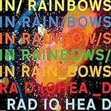
![]()
The seventh pick on our Top 10 Radiohead Album Covers list is In Rainbows. In Rainbows is Radiohead’s seventh studio album. This album is personal for the band. The band wanted the fans to be more involved with this album. The album cover features the name of the album written multiples times in different colors. The band’s name is also written in different colors. The background is black, but the colors surrounding the background take away from the darkness. The colors in the picture represent the colors of the rainbow. The cover represents the name of the album title. The album cover looks futuristic. It looks as if Stanley Donwood captured the night sky.
Stanley Donwood splashed ink on the cover to create the look. The molten wax is featured in the center of the photo. He wanted the picture to match the theme of the album. Stanley Donwood originally wanted to depict a suburban lifestyle for the album cover, but Radiohead changed the theme of the album. They wanted the music to be more sensual so Stanley Donwood created a colorful rainbow to describe the music on the album. It is a toxic rainbow that you would see in a puddle of water. In Rainbows was released in October 2007. The album peaked at number one on Billboard 200. In Rainbows features the singles “Jigsaw Falling into Place,” “Nude,” “Bodysnatchers,” “All I Need” and “House of Cards.” The album sold over one million copies.
# 6 – A Moon Shaped Pool

![]()
A Moon Shaped Pool is Radiohead’s ninth studio album. The album features songs about climate change as well as heartbreak. The album cover is an abstract painting. It is the moon altering its shape. It is a black and white painting. When you first look at this picture it looks like a pool of water. It also looks like a Rorschach test. It has a deeper meaning. The moon changes all the time. Stanley Donwood wanted to depict that on the album cover. Stanley Donwood wanted people to talk about the photo which would explain why it is an interpretive cover. It is not an in-your-face album cover. It can be reflective of someone’s emotions constantly changing. You can’t control your emotions like the way you can’t control the shape of the moon.
Stanley Donwood created this album cover with Thom Yorke. Stanley Donwood painted the picture while Thom Yorke was singing in the background. Stanley Donwood wanted to do something more concrete, but he decided to do an abstract painting. He allowed the weather to help do the painting. He left the painting outside and the elements are what helped design the cover. No one could ever accuse Stanley Donwood of not being creative. There aren’t too many artists that would leave their paintings outside to be destroyed. A risky decision ended up creating a beautiful painting. This album cover could be hanging in a museum. A Moon Shaped Pool was released in May 2016. The album peaked at number three on Billboard 200. A Moon Shaped Pool features the singles “Burn the Witch,” “Daydreaming” and “True Love Waits.” The album sold over one million copies.
# 5 – The King of Limbs

![]()
The next pick on our Top 10 Radiohead Album Covers list is The King of Limbs. The King of Limbs is Radiohead’s eighth studio album. Radiohead changed their style with this album. They wanted to do experimental music. The album cover was inspired by fairy tales. It is a picture of trees. Stanley Donwood and Thom Yorke wanted the trees to have body parts. They wanted the trees to look like humans. The tree on the left is yellow while the one on the right is green. They are in a forest with other trees. The trees behind them don’t come to life the way the ones in the front do. The trees in the front have eyes and limbs.
Stanley Donwood and Thom Yorke created an album cover that personified the woods. They found a way to make the trees come to life. They wanted a strange picture and their plan worked. Stanley Donwood used newspaper and let it fade in the sunlight to make it look like nature. It was supposed to go along with the theme of the album. The album talks about the decay of living things. Stanley Donwood was inspired by newspapers and magazines to do this cover. The album cover is featured on our list because it is unique. The cover appears to have nothing to do with the album. If you look at the cover you would never know this was for an album. It looks like a billboard for a fairytale. The album cover is mostly dark, but there are some splashes of light to brighten up the picture. The King of Limbs was released in February 2011. The album peaked at number three on Billboard 200. The King of Limbs features the singles “Lotus Flower,” “Bloom,” “Morning Mr. Magpie” and “Giving Up the Ghost.” The album sold over 370,000 copies.
# 4 – Hail to the Thief

![]()
Hail to the Thief is Radiohead’s sixth studio album. Radiohead didn’t want to create a political album, but it happened anyway. They wanted to talk about things that mattered in the world. The album cover features a picture of a roadmap of Hollywood. There are random words on the map that appear not to mean anything. Some of the words are from Thom Yorke’s lyrics as well as political discussions. They are also taken from advertisements. The words are in colorful panels. Stanley Donwood used different colors for the words as well as the panels. The colors don’t clash with each other. There is a blue background behind the panels.
The album cover makes a statement about Hollywood trying to sell you. It could also be about politicians trying to sell you on their agenda. It could be interpreted in different ways. Stanley Donwood was inspired to do this cover because he saw the advertisements while he was riding in a car. He saw the colors and the words and thought they would make a great cover. He put the words together to create a map. Stanley Donwood used eye catching colors that will grab your attention immediately. The album cover will give you something to talk about while you are listening to the album. Hail to the Thief was released in June 2003. The album peaked at number three on Billboard 200. Hail to the Thief features the singles “There There,” “Go to Sleep” and “Two + Two = 5.” The album sold over one million copies.
# 3 – Kid A

![]()
Coming in at number three on our list is Kid A. Kid A is Radiohead’s fourth studio album. Thom Yorke was stressed out from promoting their album OK Computer. He wanted to take a break from recording rock music. He wanted to do classical, jazz and electronic music on this album. He didn’t want to write any songs that were personal. The album cover features several mountains. The mountains appear to be covered with snow. There is a reflection of the sea in the middle of the picture. Two of the mountains appear to be on fire. If you look in the background of the picture, it appears as if the sun is setting. You can see trees behind the right side of the mountain. The background is dark while the front of the picture is light.
Stanley Donwood had to live up to what he did when he created the cover for OK Computer. He had to come up with something creative for this album cover. Stanley Donwood and Thom Yorke were inspired to create this album cover when they were looking at pictures of the weather changing. They wanted to use mountains on the cover. The mountains are supposed to symbolize power. It is an unusual photo because there aren’t many pictures that feature mountains on fire. The album cover looks like it would have been a challenge to paint. Stanley Donwood did an excellent job creating a haunting picture. The picture has a nighttime setting that gives it an ominous look. It is a good blend of light and dark colors. Kid A was released in October 2000. The album peaked at number one on Billboard 200. Kid A features the songs “Everything in Its Right Place,” “The National Anthem,” “How to Disappear Completely” and “Idioteque.” The album sold over one million copies.
# 2 – The Bends

![]()
The Bends is Radiohead’s second studio album. The songs on the album have cryptic lyrics. Since the songs on the album are cryptic it coincides with the album cover. The cover features a picture of a CPR mannequin. The mannequin’s head is leaning back with its mouth open. The picture will have you guessing whether the mannequin is standing or laying down on its back. The mannequin is supposed to represent agony and ecstasy at the same time. Stanley Donwood and Thom Yorke created a creepy image of a CPR mannequin. They used the perfect image to create a cryptic look. The colors are limited on the photo. The only colors represented are the color of the mannequin, the background and the lettering.
Stanley Donwood kept the album cover simple yet intriguing. It doesn’t feature any special effects. The picture of the mannequin is enough to keep you intrigued. Stanley Donwood and Thom Yorke filmed different images for the album cover. They snuck into a hospital to get the footage. The images they filmed didn’t fit the album cover. They decided to record a picture of a CPR mannequin. Stanley Donwood noticed that one of the mannequins had an odd expression on its face. They knew that was the one they had to use. The image goes with the look the band was going for with this album. The Bends was released in March 1995. The album peaked at number 88 on Billboard 200. The Bends features the singles “My Iron Lung,” “High and Dry,” “Fake Plastic Trees,” “Just,” “Street Spirit (Fade Out)” and “The Bends.” The album sold over one million copies.
# 1 – OK Computer
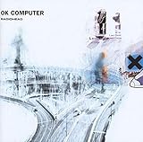
![]()
The number one pick on our Top 10 Radiohead Album Covers list is OK Computer. OK Computer is Radiohead’s third studio album. The band wanted to create a social and political album. The album cover depicts a picture of a distorted highway interchange. You can see pictures of cars on the highway. The picture is a look into the 21st century. There are different distorted pictures on the album cover. You can see a picture of a family, the tip of an airplane, a statue and business logos. The picture is bleached on purpose, so it is hard to tell what is in the picture. Stanley Donwood and Thom Yorke purposely altered the look to keep the album cover vague.
Stanley Donwood and Thom Yorke wanted the album cover to be sad and funny. They wanted it to represent the things that weren’t said in the songs. Stanley Donwood kept the mistakes in the photo instead of using a computer to take them out. He liked leaving mistakes in the photos. Since the picture is bleached, it is hard to tell what colors he wanted to use. You can see that he used white, blue, black, red and brown in the picture. If you look at it closely, it looks as if something was spilled on the cover. The album cover is unique and will leave you guessing what is hidden in the picture and where he shot it. OK Computer was released in May 1997. The album peaked at number 21 on Billboard 200. OK Computer features the singles “Paranoid Android,” “Karma Police,” “Lucky” and “No Surprises.” The album sold over two million copies.
Top 10 Radiohead Album Covers article published on Classic RockHistory.com© 2023
Classicrockhistory.com claims ownership of all its original content and Intellectual property under United States Copyright laws and those of all other foreign countries. No one person, business, or organization is allowed to re-publish any of our original content anywhere on the web or in print without our permission. All photos used are either public domain creative commons photos or licensed officially from Shutterstock under license with ClassicRockHistory.com. All photo credits have been placed at the end of the article. Album Cover Photos are affiliate links and the property of Amazon and are stored on the Amazon server. Any theft of our content will be met with swift legal action against the infringing websites.
![]()