

Feature Photo: Featureflash Photo Agency / Shutterstock.com
Our list of 10 most underrated rock music album covers from the 1970s presents a showcase of album covers that cross all genres of rock music from the wonderful decade of the 1970s. The criteria we utilized to place these albums on this list were essential in helping us pick only 10. First and foremost, the cover had to be uniquely original. There were many great album covers that were parodies of 60s album covers and, as entertaining as they were, we just felt that based on our first criterion of originality, we would refrain from listing those.
The second criterion was that the covers had to be memorable. They couldn’t be gimmicky; they had to have a lasting impact on music fans. Of course, the covers also had to be entertaining, interesting, exciting, and simply jaw-dropping. It was those album covers that sometimes you had never even heard of before, but damn, the cover just blew your mind when you first saw it in the record stores that you had to buy.
That’s what you call a “Now” cover—a piece of art that forces you to buy the album before you ever even heard one song, simply because the art convinces you that whatever is on the inside is going to be good. They wouldn’t have wasted all this time to make such a fabulous album cover if the music wasn’t worth it. Most of the time it was, but then again, of course, there were some album covers that totally blew away the music inside, but those we’ve ignored for this list. We don’t like to be insulting to anybody. This one was fun to put together because it brings back a lot of memories. It’s also not the typical list you see across the internet.
# 10 – Hasten Down The Wind – Linda Ronstadt
![Hasten Down the Wind by Linda Ronstadt [Music CD]](https://m.media-amazon.com/images/I/51Tof3Xj64L._SL500_.jpg)
We open up our “10 Underrated Rock Music Album Covers Of The 1970s” list with Linda Ronstadt’s striking album cover for her Hasten Down the Wind album. This is one of those covers that depict both adventure and romance. It’s dark, yet light enough to either represent sunrise or sundown. The shadow of the horse and rider in the background is open to interpretation, but one kind of gets the sense they are leaving Linda behind, as the album title embodies and that expression on Ronstadt’s face defines. The Hasten Down the Wind album was released during the summer of 1976. It would become a Grammy Award-winning album for Linda Ronstadt.
Read More: Top 10 Linda Ronstadt Songs
# 9 – Plastic Letters – Blondie

Continuing with our “10 Underrated Rock Music Album Covers of the 1970s” list, we present an album from one of our favorite bands of the 1970s. About a year before the band released Parallel Lines, which would turn the group into household names with their smash hit “Heart of Glass,” Blondie released the album Plastic Letters. The band was featured on the album cover sitting on a New York City police car. The imagery of punk new wave rebellion just drips all over the cover with a big question mark. Debbie Harry looks stunning on the cover, as usual. This was the band’s second studio album. It was released in February of 1978.
Read More: Top 10 Blondie Songs
# 8 – Ghost Writer – Garland Jeffreys

While Garland Jeffreys may not be a household name, most fans of classic rock music who like to delve beyond just the popular hits are probably aware of his work. This was one of those albums that caught my eye in the record store. There’s just something really interesting about the album cover that made me buy it without ever hearing a note on it. He would become one of my favorite artists of all time. Jeffreys blends rock and roll, soul, and reggae unlike anybody else ever has. If you’re not familiar with his music, I definitely recommend checking him out, starting with this album.
Read More: Top 10 Garland Jeffreys Songs
# 7 – Germfree Adolescents – X-Ray Spex

Now, you may look at this album cover and the band’s name and ask yourself, “Who?” I mean, are you kidding me? Well, this is an article that focuses on underrated rock album covers. And in many definitions of the word “underrated,” it means possibly album covers that you’ve never heard of or never seen before. There’s an entertainment aspect to this article as well as a historical one. X-Ray Spex was a punk band from the UK that released their first album in 1978. I always thought that this was a very interesting album cover. The whole idea of teens stuck in test tubes with very colorful clothing just seemed quite original and that was a very big part of the criteria for this list.
# 6 – Brain Salad Surgery – Emerson Lake & Palmer

Now this is an interesting one. In the early 70s, Emerson, Lake & Palmer were on the hunt for a striking album cover that could encapsulate the essence of their progressive rock sound. During a European tour stop in Zurich in April 1973, Keith Emerson and the band’s manager, Peter Zumsteg, dropped by the home of avant-garde artist H.R. Giger. Fresh off a concert, Emerson was introduced to Giger’s latest creation, a dark, skull-centric triptych titled Work 216: Landscape XIX. The timing was perfect as the artwork’s eerie vibe perfectly aligned with ELP’s intense style, leading Emerson to instantly select it for their upcoming album, initially titled “Whip Some Skull on Ya,” a slang for fellatio, later changed to “Brain Salad Surgery” after a lyric from Dr. John’s “Right Place, Wrong Time.”
# 5 – Wish You Were Here – Pink Floyd
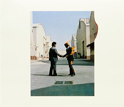
At the halfway point on our “10 Underrated Rock Music Album Covers of the 1970s” list is a legendary Pink Floyd album cover. Most attention has always focused on Dark Side of the Moon. However, I always thought Wish You Were Here was a far more interesting album cover. The album was initially wrapped in a black shrink-wrap, making the artwork invisible to buyers and symbolizing the absence at the heart of the album’s songs. This idea was influenced by the packaging of Roxy Music’s Country Life.
The iconic cover image, shot by Aubrey “Po” Powell of Hipgnosis, depicted two businessmen, one engulfed in flames, shaking hands—an image inspired by the hazards of concealing one’s true feelings in a cutthroat industry. The phrase “getting burned” took on a literal and figurative significance, captured in the dramatic photograph of the stuntmen Ronnie Rondell and Danny Rogers at Warner Bros. Studios. The shoot was fraught with challenges, including a mishap where the wind blew flames into Rondell’s face, burning his moustache. The final image used for the album cover was a powerful visual metaphor for the themes woven throughout the album, emphasizing the personal and professional dangers of inauthenticity.
# 4 – Quadrophenia – The Who

While The Who’s Who’s Next album cover often gets the most recognition and critical acclaim, I’ve always preferred the cover for Quadrophenia. I thought it was way more interesting than any of the band’s other album covers, and they did release a whole lot of great ones. This album cover really depicts the music inside the album, and I love how the man’s face shows up in the rearview mirrors. Quadrophenia was the album that followed up Who’s Next. That’s how you do it, Pete. Quadrophenia was released in 1973.
# 3 – Goodnight Vienna – Ringo Starr

# 2 – Nether Lands – Dan Fogelberg

# 1 – Captain Fantastic & The Brown Dirt Cowboy – Elton John
![Captain Fantastic & Brown Dirt Cowboy [CD]](https://m.media-amazon.com/images/I/612rPVuFN1L._SL500_.jpg)
10 Underrated Rock Music Album Covers Of The 1970s article published on Classic RockHistory.com© 2024
![]()


Really appreciated the back-story of ELP’s LP cover art on “Brain Salad Surgery”, as it is, in my opinion, (along with Santana’s “Abraxas”) one of the most intriguing covers of the 1970s, as well as the others noted in the listing.
Also, pleased to finally find out the factoid that ELP utilized Dr. John’s lyric expression from “Right Place, Wrong Time” for their title, instead of visa versa.