

Photo: Nick Contador / CC BY-SA (https://creativecommons.org/licenses/by-sa/4.0)
In the roughly quarter-century which represented their main period as a recording entity, Genesis’ studio releases were represented by a fairly wide variety of images on their respective covers: Some beautiful, some disturbing, some that could be either or both at the same time. On some covers appeared seemingly random patterns of shapes and colors, while others were illustrations which were very specific to the records’ lyrical content.
Like most bands who picked up steam in the years immediately following the Sixties, Genesis eschewed the cult of personality which had once defined rock, enticing their fans an air of mystery instead. Thus, Genesis never appeared on their studio album covers. They continued this practice even into the Eighties, when not only did image once again become crucial but band member Phil Collins emerged as one of the most recognizable figures of the era (by sharp – and probably intentional – contrast, the covers of Phil Collins’ solo albums featured close-ups of his face from various angles).
Either way, a handful of different artists, graphic designers and approaches were used in creating the Genesis album covers over the course of their career, and we believe these to be the ten best of them.
# 10 – Wind and Wuthering

![]()
The second and final album from the band’s short-lived but formidable four-piece line-up (released in 1976) was also their third time using the famous British graphic design term Hipgnosis, who in the Seventies and early Eighties would create distinct cover artwork for dozens of artists ranging from Pink Floyd to Olivia Newton-John. Wile their Wind and Wuthering graphics were probably not among their more distinct, the simple imagery and color scheme works perfectly well in the end.
# 9 – Abacab

![]()
Probably the simplest image of any Genesis studio album cover, it’s essentially meant to appear as a series of torn paper scarps in various colors. It was designed by artist British artist Bill Smith, who would later state that he found the members of Genesis to be very difficult to please when it came to their cover artwork (despite this, Smith returned to design the band’s next studio album). And there was even a slight twist when Abacab was first released in 1981, as Genesis issued four different versions of the cover simultaneously, with the colors varied on each (Phil Collins cohort Sting and his band The Police would up the game a few years later, when their 1983 album Synchronicity was released with thirty-six cover variations).
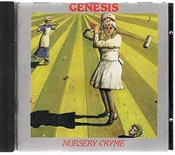
# 8 – Nursery Cryme
![]()
The first album to feature the classic five-piece Genesis line-up (Peter Gabriel, Tony Banks, Mike Rutherford and new members Steve Hackett and Phil Collins Nursery Cryme (1971) artwork by illustrator Paul Whitehead, which depicts a young girl enjoying the very British pastime of croquet… Using severed heads as the balls (some members of the public at the time understandably found this more than a bit shocking, rare for a band that would never elicit much in the way of controversy). The “house” which can be seen on the upper right of the cover is apparently designed after the Victorian home where Peter Gabriel spent his own childhood.
# 7 – We Can’t Dance

![]()
After a five-year absence, Genesis came back with what would ultimately become the final studio release for the band’s most successful and longest-running line-up. Several tracks on We Can’t Dance saw a return to lengthier songs and darker subject matter, while another throwback of sorts appeared in the form of illustrations which corresponded with each individual track (a first for Genesis since A Trick of the Tail).
Felicity Roma Bowers created all of the beautiful and simple artwork for the 1991 release, including the cover image which shows what appears to be a featureless child alongside taller version of the same person (his father? His older self?) looking towards the sky, with the latter figure reaching up holding what appears to be either a torch or a paintbrush. The only misstep on the albums’ overall graphic design can be said to be the introduction of the clunky “balloon animal” Genesis logo (seriously: Do any fans actually like it?).
# 6 – Foxtrot

![]()
It could be argued that the first two studio albums from the classic five-piece Genesis line-up, Nursery Cryme (1971) and Foxtrot (1972) are sort of companion releases, and this extends to the artwork for both being provided by Illustrator Paul Whitehead. Rather than a central figure (as on the Cryme cover), there’s a bit more going on on Foxtrot, which includes a woman with the head of a fox standing on some sort of flouting surface in the water. And that’s just the front cover… On the other side, on horseback are four individual who appear to be on the “hunt” (presumably for our fox-lady), and upon closer examination, we can see that one of them is a monkey, while another is some kind of extra-terrestrial (in the end, this all may have proven to be a bit too nightmare-inducing, as it became Whitehead’s final design for the band).
# 5 – Selling England By the Pound

![]()
The first any only Genesis cover by British artist Betty Swanwick was in fact not commissioned for the album, but instead had been an original creation of hers entitled “The Dream.” The borderline-surreal image shows a man (homeless?) sleeping on public bench while behind him others enjoy their day in the park. Like most Genesis album cover artwork for this period, it’s both endearing and a bit disturbing (although on some level it may also have been a metaphor for the class division in England). The only variance which was added specifically for the 1973 album is the inclusion of the lawnmower on the left hand side, a reference to the lyrics of the track “I Know What I Like (In Your Wardrobe).” Apparently, Swanwick agreed to add the gardening tool to her original, because there would not have been time for her to paint an entirely new illustration.
# 4 – A Trick of the Tail

![]()
A Trick of the Tail (1976) was the first Genesis album to feature Phil Collins doing all lead vocals, but for the artwork it represented the band’s second hiring of the Hipgnosis design team, with member Colin Elgie taking the principle credit for creating the images on the album. The relatively simple but unique drawings presented against a yellow background were by far the most literal – in regards to the records’ content – artwork of any Genesis album, since between both the front and back cover, all of the album’s eight tracks are represented by different characters. Still, some songs clearly lent themselves to close interpretation better than others. “Robbery, Assault & Battery,” for example, is a mini-opera which involves multiple players (including a burglar, the song’s protagonist) who are depicted in the drawings. By contrast, “Los Endos” is an instrumental and is represented here by… a guy lying on the floor, presumably dead (well, in all fairness, you can’t get much more “endos” than that).
# 3 – … And Then There Were Three…

![]()
… And Then There Were Three… (1978) was the first Genesis album from what would become the longest-running and most successful line-up of the band. It was unquestionably a departure musically, overall much closer to straight-ahead rock and featured mostly shorter tracks with no multi-part songs or instrumentals. This cover artwork was also a bit different than what fans had come to expect. Among the few Genesis covers to favor photography over illustration, it featured an image set against a lavish red/purple-ish night sky, and in the foreground are three anonymous men (not, in fact, the three members of the band, though easily mistaken for them) seemingly just “hanging around” (it’s up to us to guess the specifics of what’s actually going on).
This cover was also unique within the Genesis catalog in the fact that the image really doesn’t reflect any lyrics or themes on the album. This is partially because, according to some accounts, the cover was apparently a bit of a rush-job, which is why it ended up as the their final collaboration with Hipgnosis after both the band and the design team seemingly agreed that the project had been a failure (an opinion probably not shared by many Genesis fans or even people who just love cool album cover artwork).
# 2 – Duke

![]()
After the more straightforward rock album … And Then There Were Three.., their next release saw Genesis splitting the difference between their prog roots and evolved pop sensibility. On Duke (1980), the simple but unquestionably distinctive cover illustration presents a figure who appears to have tiny head which contrasts his conspicuously oversized suit (maybe where David Byrne got the idea?) looking out of a large, lopsided window.
Our window-gazer-slash-victim-of-bad-tailoring not only has a proper name – “Albert” – but had appeared elsewhere previously, although probably no one would have noticed had they been outside of France or older than seven. Genesis apparently spotted the children’s book L’Alphabet D’Albert (Albert’s Alphabet) and asked the illustrator, Lionel Koechillin, to create new artwork for the album which featured the character.
Seen from pretty much any other angle than behind, the Albert character – with his needle-nose and gravity-defying hair – might seem a bit more creepy than sympathetic, which may explain why Duke is pretty much the only exposure that the he, and Koechillin’s work, have had in the English-speaking world (despite the band giving L’Alphabet D’Albert a plug in the liner notes). Still, recycling a character whose inception had been elsewhere hasn’t stopped the Duke cover from becoming one of the most recognizable visual images in the band’s history.
# 1 – The Lamb Lies Down on Broadway

![]()
The final and most epic studio release from the classic five-piece line-up of Genesis was also their first collaboration with Hipgnosis, and needless to say the pairing was an overwhelming success on all fronts. The Lamb Lies Down on Broadway (1974) is an elaborate two-record concept album based around the story of a young man named Rael and his misadventures in New York City. With a story that features a (relatively) concise narrative over four sides and twenty-six tracks, there’s clearly a great deal going on here, and the cover – designed by Hipgnosis member Richard Manning – is no exception. A complete departure from the band’s previous use of surreal and haunting illustrations, here the cover shows three black-and-white photographs. The far left- and center image related to the songs “In the Rapids” and “Riding the Scree,” while Real steps out of the third photo (leaving his shape behind) to observe the action in the other two (three equally compelling black & white photographs on the back cover give you just as much to think about while you’re listening to the record).
Check out this article’s author Richard Cummins and the great books he authored available at Amazon
Just click on the title or pic
Name, Rank, Rock ‘n’ Roll: Famous Musicians Who Served in the Military

![]()

![]()


i’m just here to see if others agree that Foxtrot and Nursery Crime are 2 of the ugliest album covers from a reputable band.
I dont agree at all, those two covers are probably my favourite Genesis covers, along with the Selling England one. How a cover like Abacab on the other hand made this top 10 list defeats me .
I always figured that the gentleman on the left of …and then there were three… is none other than Jim Cooley himself.