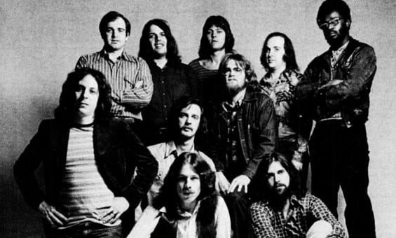
Feature Photo: Northfoto / Shutterstock.com
Our Top 10 Grateful Dead Album Covers list will look at a legendary band who formed in the 60s. The Grateful Dead is known for having an eclectic style when it comes to their music. They sing rock, folk, country, gospel, reggae and psychedelia music. Their fans are known as Deadheads. They have been picked as one of the greatest bands of all time. They have had one of the highest-grossing tours of all time. The Grateful Dead have sold over 35 million albums worldwide. They have received a Lifetime Achievement Award at the Grammys. They were selected for induction in the National Registry of the Library of Congress. Twelve of the members have been inducted into the Rock and Roll Hall of Fame.
The Grateful Dead are known for using different imagery for their album covers. If you are a Deadhead, you are familiar with these images. Some of the images include skull and roses, jester, dancing bears, dancing terrapins, as well as others. They have used these images on their concert posters and album covers. Their album covers feature different designs to go with the nature of the band. Their album covers are interesting and unique. They tell stories without words. The photographers took mesmerizing pictures for the covers. The Grateful Dead were known for redefining music and they did the same thing with their album covers. Our Top 10 Grateful Dead Album Covers list will celebrate their creative album covers.
# 10 – In the Dark

![]()
The first pick on our Top 10 Grateful Dead Album Covers list is In the Dark. In the Dark is the Grateful Dead’s 12th studio album. This is surprisingly the band’s only top 10 album. The album became popular unexpectedly. The album shows the band’s mature side. The album cover features the eyes of the band members. The shape of their pictures forms an eye. The band’s name and album title also form an eye. Two sets of eyes are placed at the top. Three sets of eyes are in the middle. Two sets of eyes are at the bottom. There were only six members in the band when they recorded this album, but there are seven sets of eyes in the picture. The seventh pair of eyes is a friend of the band. The eyes are set on a black background. The band’s name and album title are two toned. The band’s name is blue and pink while the album title is pink and blue.
This album cover is simple compared to the Grateful Dead’s other album covers, but this one is creative. Designer Randy Tuten came up with a creative way to place the band’s pictures together to create another image. You can spend time wondering which member is which on the album cover. He kept an element of mystery by concealing their identities. The black background adds to the mystique of the cover. It gives it an ominous and creepy feel. The album cover is just as creative as the music.
Randy Tuten has worked with the Grateful Dead, Jefferson Airplane, Santana, The Pointer Sisters, Terry Garthwaite, Earth Quake, Virgil Hart, Lynyrd Skynyrd, The Byrds, Jerry Garcia, as well as others. In the Dark was released in July 1987. The album peaked at number six on Billboard 200. In the Dark features the singles “Touch of Grey,” “Tons of Steel,” “Throwing Stones,” “Black Muddy River” and “When Push Comes to Shove.” The album sold over two million copies.
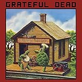
# 9 – Terrapin Station
![]()
The next pick on our Top 10 Grateful Dead Album Covers list is Terrapin Station. Terrapin Station is the Grateful Dead’s ninth studio album. This album was voted as one of the best albums of all time. The album was unusual for them at the time. The music on this album was a departure from their sound on their previous albums. Jerry Garcia wasn’t thrilled with the recording process.
The album cover features a picture of two terrapins dancing outside of a train station. The terrapins are holding tambourines. One of the terrapins is faced towards the right while the other has its back faced front. The train station is in the middle of the woods. It is in the shape of a house. You can see train tracks in front of the turtles. There is a red toolbox and a black trunk on the right side of the album cover. There is also a red chair in between the terrapins. There’s grass and trees behind the train station. There is a bird flying in the sky. Clouds are in the sky. There is a red border around the picture. The band’s name is written in the red border while the album title is written on the train station.
Alton Kelley and Stanley Mouse created an interesting photo for the band. Terrapins have become one of the images linked to the Grateful Dead. Alton Kelley and Stanley Mouse personified the terrapins by having them playing with tambourines and dancing. We know turtles would never be seen playing tambourines and dancing. You can’t help smiling while looking at the album cover. The cover art fit with the album because there are a couple of songs that fit the theme.
Alton Kelley and Stanley Mouse are artists who have worked with the Grateful Dead, Journey, Bob Weir, Mickey Hart, Jerry Garcia Band, Steve Miller Band, Rockets, Billy Thorpe, The Allman Brothers Band, Robert Hunter, as well as others. Terrapin Station was released in July 1977. The album peaked at number 28 on Billboard 200. Terrapin Station features the singles “Dancin’ in the Streets,” “Samson & Delilah,” “Sunrise” and “Passenger.” The album sold over 500,000 copies.
# 8 – Grateful Dead (Skull & Roses)

![]()
The eighth pick on our Top 10 Grateful Dead Album Covers list is Grateful Dead (Skull & Roses). Grateful Dead (Skull & Roses) is the Grateful Dead’s second live album. This album isn’t as psychedelic as their previous live album. This is one of the band’s best-selling live albums. The album cover is based on an illustration by Edmund Joseph Sullivan. It features a picture of a skeleton in a circle that may represent the sun or the moon. The skeleton’s picture is from the shoulders up. It has red roses around the skull. There are two yellow ribbons behind the roses. There are two circular images on the outside of the circle. There are rays by the circular images. The skeleton is against a sky-blue background. There is a yellow border around the skeleton. The band’s name is written in a separate border. The inside is sky blue. The band’s name is written in yellow and red letters.
This picture is another image that became one of the band’s logos. Alton Kelley and Stanley Mouse thought this image was fitting for the band. They were at the library looking through art books to find inspiration for the album cover. They happen to see an image in a book and knew it fit the band perfectly. They designed the picture based on Edmund Joseph Sullivan’s work. They wanted to create something that was eye-catching so they chose this picture with the colors. The band loved the picture and wanted to use it for their album cover. It was a wise decision to use it because it is unique and stands out. The colors are eye-catching so Alton Kelley and Stanley Mouse accomplished what they set out to do. Grateful Dead (Skull & Roses) was released in September 1971. The album peaked at number 25 on Billboard 200. The album sold over 500,000 copies.
# 7 – Aoxomoxoa

![]()
The seventh pick on our list is Aoxomoxoa. Aoxomoxoa is the Grateful Dead’s third studio album. The album is a palindrome. The music on the album has a psychedelic vibe. The music reflected the album cover. The album cover is a picture of the sun. The sun represents an egg being fertilized. There is a skull and cross bones at the bottom of the cover. It is holding two eggs. There are fertility images throughout the album cover. The bottom half of the album cover represents rebirth and death. The sun is beaming down to help life grow. There are two trees in the picture. There are several fertilized eggs throughout the cover. If you look inside the border there is a picture of dark eggs. They symbolize death. There are two smoking vessels inside of the black background. There is a yellow and red border around the cover. The band’s name and album title are written in calligraphy.
Psychedelic and surf artist Rick Griffin wanted to create a psychedelic vibe for the cover. He thought it would be a good way to describe the music for the album. He decided to use ambigram for their name as a treat for fans. If you look closely, their name reads differently from what it is. This cover stands out because there’s a lot going on in the picture. There is something at the top as well as the bottom of the picture to keep you entertained. You wouldn’t need to see the band on the cover to connect this with them. It is unique and features one of their logos. The skull and bones are at the bottom of the picture.
There is an excellent use of dark and light colors to make the cover stand out. He let his imagination run wild with this picture. This is a cover you can see on a comic book. Rick Griffin worked with the Grateful Dead, The Challengers, The Sparrows, Jeffrey Cain, Steppenwolf, The Neutrons, The Eagles, Jackon Browne, Neil Young, Sweet Comfort, Fred Blassie, Denny Correll, as well as others. Aoxomoxoa was released in June 1969. The album features the singles “St. Stephen,” “China Cat Sunflower,” “Rosemary” and “Mountains of the Moon.” The album sold over 500,000 copies.
# 6 – American Beauty

![]()
American Beauty is the Grateful Dead’s fifth studio album. The music on this album features folk rock and country music. The album was innovative at the time. The band wanted to reinvent music with this album. The album cover features a wood panel. There is a circle in the middle of the panel. The circle is green and has cracks in it. The circle has a gold border inside of the circle. There is a picture of a rose in the center of the circle. The album title is written above and below the rose. The writing is written in ambigram. It is supposed to be American Beauty, but it looks like American Reality. The letters are turquoise and purple. The band’s name isn’t written on the album cover.
The dynamic duo of Alton Kelley and Stanley Mouse brought attention to the rose. The rose will become linked to the band for life. In addition to the rose, the duo wanted to use ambigram for the text. The text is difficult to read but it is inventive. They used different colors for the lettering. They did an amazing job blending the colors together for the text.
They combined a realistic image (the wood panel) with the artwork in the middle of the picture. The band’s name isn’t on the album cover, but it doesn’t need to be. Deadheads will recognize this as one of their album covers based on the rose and the text. The colors in the cover art will grab your attention immediately. American Beauty was released in November 1970, The album peaked at number 30 on Billboard 200. American Beauty features the singles “Truckin’,” “Ripple,” “Sugar Magnolia,” “Friend of the Devil” and “Box of Rain.” The album sold over two million copies.
# 5 – Blues for Allah

![]()
The next pick on our Top 10 Grateful Dead Album Covers list is Blues for Allah. Blues for Allah is the Grateful Dead’s eighth studio album. This was one of the band’s highest-charting albums until In the Dark was released. The band experimented with different sounds on this album. The album cover features a picture of a skeleton playing the fiddle. The skeleton has frizzy white hair. It is wearing a long red robe. The skeleton is wearing red sunglasses. The skeleton is sitting in the window of an ancient stone wall. There is a green galaxy behind the skeleton. The band’s name is written in ambigram. The album title is written in calligraphy on three stones.
Phillip Garris came up with an innovative picture for the album cover. He used the band’s logo as the main attraction of the album cover. We have never seen a skeleton playing a fiddle before. It is an imaginative idea for the picture. He is a talented artist that made this picture look believable. He used soft colors that are easy on the eyes. You can’t help staring at this amazing picture. You can look at it for hours because it has a relaxing element to it. The album cover won an award and it was well deserved. Phillip Garris is a visual artist who has worked with the Grateful Dead, Kingfish, Toto, Tavares, Chanson and Medusa. Blues for Allah was released in September 1975. The album peaked at number 12 on Billboard 200. Blues for Allah features the singles “Help on the Way,” “Franklin’s Tower,” “Slipknot,” “Crazy Fingers” and “Blues for Allah.”
# 4 – Reckoning

![]()
Reckoning is the Grateful Dead’s sixth live album. This album contains acoustic versions of their live songs. ]The album cover features a picture of a skull and crossbones inside of a black circle. There are red and blue borders around the circle. The skull’s head has a crack on the side. The crossbones are underneath the skull. There is a heart with yellow roses wrapped around it on the bones. There is a red Pegasus on top of the heart. There is a blue image in between the skull and the heart. The skull covers the band’s name. The design is a white background. The album title on the bottom of the cover in red letters.
Rick Griffin designed an amazing cover for the album. He designed a cover that suits the band. He used their signature images for the cover. He knew how to get in touch with what represented the band. Rick Griffin has a talent to create images that are completely different from each other. He has worked with them multiple times, but the covers are all different. The covers stand out in their own way. If you are buying an album, this cover would stand out among the pack. This cover art could be a tattoo or a design on a jacket or shirt. Reckoning was released in April 1981. The album peaked at number 43 on Billboard 200.
# 3 – Shakedown Street

![]()
Coming in at number three on our list is Shakedown Street. Shakedown Street is the Grateful Dead’s 10th studio album. They wanted to create music that felt like a party with this album. This album incorporated disco and soft rock music. The album cover is an illustration of a busy street. There are several cars parked on the street. There are also cars going through the street. There are two motorcycles on the cover. There are people standing on the corner. Multiple people are walking down the street. You can see a dog crossing the street. There are vibrant buildings on both sides of the street. The sky is blue. The band’s name and album title are written on top of the cover. There is a long blue reflection behind the album title. The band’s name is written in white letters while the title is yellowish green.
This is a fascinating picture of a busy street through Gilbert Shelton’s eyes. It is a realistic story of life in a busy city. The police would be on the block and there would be a crowd of people on the sidewalk. There would also be a lot of cars coming and going through the street. This is a different album cover for the Grateful Dead because it doesn’t feature their signature logos/imagery that they are known for having on their album covers. Gilbert Shelton wanted to pay homage to the studio where the band had their practice sessions. This album cover stands out without using their signature logos. Gilbert Shelton is a cartoonist who is best known for working with the Grateful Dead. Shakedown Street was released in November 1978. The album peaked at number 41 on Billboard 200. Shakedown Street features the singles “Good Lovin’,” “Shakedown Street,” “Fire on the Mountain” and “Stagger Lee.”
# 2 – What a Long Strange Trip It’s Been: The Best of the Grateful Dead
![]()
What a Long Strange Trip it’s Been: The Best of the Grateful Dead is the Grateful Dead’s second compilation album. This is a double CD. One CD contains mostly studio tracks while the other CD has live versions of their songs. The album cover features a picture of a black metalized skeleton. The skeleton is against a black background. There is a dim light shining on the skeleton. The band’s name and album title are written in red writing. The letters are dripping like blood. “The Best of the” is written in white letters on top of the band’s name. The letters are written in calligraphy.
Rick Griffin usually designed brighter album covers for the band, so he decided to switch things up. He designed a gothic album cover. This looks like an image from a horror movie. It would make a great poster for a scary movie. Rick Griffin used dark colors for the cover. The only light he used was the light illuminating from the skeleton and the lettering from the album title. The darkness adds to the intrigue of the picture. Rick Griffin did an excellent job airbrushing the image for the cover. Rick Griffin put a different spin on the skeleton logo by making it metallic. What a Long Strange Trip It’s Been: The Best of the Grateful Dead was released in August 1977. The album sold over one million copies.
# 1 – Skeletons from the Closet: The Best of Grateful Dead

![]()
The number one pick on our Top 10 Grateful Dead Album Covers list is Skeletons from the Closet: The Best of Grateful Dead. Skeletons from the Closet: The Best of Grateful Dead is the Grateful’s Dead first compilation album. This album was a way for the label to utilize the songs in the band’s catalogue after they left the label. The album cover is an illustration. It depicts a picture of a skeleton holding a record on its right hand. The record is gold. It is holding a cigarette in its left hand. There is smoke going up towards the top of the cover. A woman is behind the skeleton. She is holding a red rose on the record. She has blonde hair. There is a man behind her. He is wearing sunglasses. There are flames in the reflection of the sunglasses. He is grabbing her hand. He has a demonic look on his face. The images are in front of a two-toned background. The colors are light and dark blue. There is a red border around the album cover. The lettering is in yellow.
Graphic artist John Van Hamersveld illustrator an amazing album cover. The band wasn’t with the label anymore, so they didn’t have any input with the album cover. The album cover is ominous because the man on the album cover has a devilish look on his face. He has flames reflected in his sunglasses which makes him appear like the devil. The band may not have helped with the album cover, but John Van Hamersveld still incorporated the rose and skull that was linked to the band. It is not exactly like their signature skull and rose logos, but they are represented on the album cover. This picture is different, but it is imaginative. This cover makes you think. Why is the man grabbing the woman? Why is the skeleton holding a record on its hand? Why is the woman putting a rose on the record? The questions are endless.
John Van Hamersveld has worked with the Grateful Dead, The Beatles, Jefferson Airplane, The Rolling Stones, Kiss, The Beach Boys, The Vogues, The Ventures, Bobby Womack, Touchstone, Vikki Carr, Shirley Bassey, Willie Nelson, Steve Miller Band, Bill Withers, Sly & the Family Stone, New Birth, Bonnie Raitt, Jim Morrison, Blondie, John Cougar, as well as others. Skeletons from the Closet: The Best of Grateful Dead was released in February 1974. The album peaked at number 75 on Billboard 200. The album sold over four million copies.
Top 10 Grateful Dead Album Covers article published on Classic RockHistory.com© 2023
Classicrockhistory.com claims ownership of all its original content and Intellectual property under United States Copyright laws and those of all other foreign countries. No one person, business, or organization is allowed to re-publish any of our original content anywhere on the web or in print without our permission. All photos used are either public domain creative commons photos or licensed officially from Shutterstock under license with ClassicRockHistory.com. All photo credits have been placed at the end of the article. Album Cover Photos are affiliate links and the property of Amazon and are stored on the Amazon server. Any theft of our content will be met with swift legal action against the infringing websites.
![]()