

Feature Photo: Ben Houdijk / Shutterstock.com
Our Top 10 The Cure Album Covers list will look at an English rock band who have been together since the 70s. They have a strong influence on gothic rock. Their musical style and lead singer Robert Smith’s look played a part in them influencing goth rock. When the band changed their musical style, they became more popular. The Cure has sold over 30 million albums worldwide. The band was inducted into the Rock and Roll Hall of Fame in 2019. The Cure has won several awards throughout their career. The Cure didn’t want to be put in a box musically. They play whatever music they feel like playing. They have recorded dark and gloomy songs, but they have upbeat tracks as well. They have always been a band that created music based on how they felt regardless of the genre.
The Cure’s album covers can be described as different. Their covers reflect their style. They may be in a gothic place one minute and an upbeat place the next and their artwork reflects that. The album covers are created based on the mood of the band. The photographers know that first impressions mean everything so they do their best to make The Cure stand out from the others. The Cure’s album covers aren’t just headshots. They are different pictures that range from headshots to imagery. No matter what picture is on the cover, it will be something that fans will enjoy. Our Top 10 The Cure Album Covers list will focus on the creativity of the band’s artwork.
# 10 – Three Imaginary Boys

![]()
The 10th pick on our Top 10 The Cure Album Covers list is Three Imaginary Boys. Three Imaginary Boys is The Cure’s debut studio album. The band didn’t have complete control over this album. The label decided which songs were going to be on the album. They also decided on the artwork for the album cover. The band wrote different types of songs for the album, so they wrote about a variety of subjects. The album cover features a picture of a lamp, refrigerator and vacuum. The lamp is a standing lamp. The lamp has an orange shade. The light is on. You can see the cord behind the vacuum cleaner. The refrigerator door is open. The background is pink. The band’s name is on the top right of the album cover. The letters are written in bold black letters. The album title isn’t featured on the album cover.
Photographer Bill Smith was at a crossroads when it concerned creating the artwork for the album. He had trouble because Robert Smith didn’t tell him what he wanted for the album cover. Bill Smith was checking out different artists to get inspired. He checked out artists like Jeff Koons and Richard Hamilton because they used appliances for their artwork. It occurred to Bill Smith that he could use that for the Cure’s album cover. He wanted to make the cover look like something from a home magazine. He wanted the cover to appeal to the band’s suburban fans. He did a good job making it look like something from a magazine because that’s what it looks like. This looks like an album cover that would be on the cover of a home or lifestyle magazine.
Bill Smith has worked with The Cure, The Paisleys, Anthony Braxton, Peggy Lee, Joe Beck, Connie Francis, The Jam, Dizzy Gillespie, Bing Crosby, Ella Fitzgerald, Neil Sedaka, James Brown, Milt Jackson, Hank Williams, The Three Degrees, The Who, as well as others. Three Imaginary Boys was released in May 1979. The album features the singles “10:15 Saturday Night,” “Foxy Lady,” “Grinding Halt” and “Another Day.”
# 9 – Greatest Hits

![]()
The ninth pick on our Top 10 The Cure Album Covers list is Greatest Hits. Greatest Hits is The Cure’s fifth compilation album. This album was released because their obligation with their label was done. They owed their label one more album, so they did a greatest hits album. Robert Smith wanted to be the one who picked the songs for the album. The album features the singles they have performed throughout their career. It also has two new songs. The album cover features a picture of Robert Smith. His arms are stretched out in front of him. His hands are blocking his face. He is wearing a black shirt and pants. He is wearing a ring and bracelets. There are star ornaments hanging down in the picture. Some of the stars are on Robert Smith’s fingers. The wall is two toned. The top of the wall is dark and the bottom is light. The band’s name is written in yellow letters while the title is written in white letters. They appear on Robert Smith’s hands.
Robert Smith shields his identity while being on the cover. The Cure didn’t want to be on their album covers so you won’t see them on too many of their album covers. The photographers from Stylorogue respected that so they compromised with the band. They had Robert Smith on the cover, but his hands shield his identity. Stylorogue did a great job shielding Robert Smith’s face. They chose dark colors which makes it easier for Robert Smith to blend in with the colors. The light colors give the picture some light and take away from the darkness.
Stylorogue has worked with The Cure, The Passions, The Stranglers, Wham!, Shadow Talk, Orange Juice, Alison Moyet, David Cassidy, Level 42, Howard Jones, Maxie Priest, Meat Loaf, Tina Turner, Katrina and the Waves, as well as others. Greatest Hits was released in November 2001. The album peaked at number 58 on Billboard 200. Greatest Hits features the singles “Cut Here,” “Just Say Yes” and “Wrong Number.” The album sold over one million copies.
# 8 – Galore: The Singles
![]()
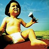
The eighth pick on our Top 10 The Cure Album Covers list is Galore: The Singles. Galore: The Singles is The Cure’s fourth compilation album. The album contains singles from their seventh through tenth albums in the 80s and 90s. The album received positive reviews. The album cover is a picture of a baby holding an ice cream cone. The baby has ice cream on its mouth. The baby is wearing a pamper and a hat. The baby is sitting on a red blanket. The baby is sitting on the beach. The baby seems to be distracted by something. There is a blue sky with clouds. You can see a shot of the ocean in the distance. The band’s name and album title are written on the right side of the cover. They are written in dark letters.
Designer Andy Vella made the baby look larger than life. The baby is superimposed so your focus will be on the baby. He used a yellow hue to make the baby look as if a tan had formed on the skin. He couldn’t have picked a better day to have taken the picture because it looks like a beautiful day. The vibrant colors he used are eye catching. The baby could be a metaphor. The songs on the album are Robert Smith’s babies. The baby could represent the songs being Robert Smith’s babies. You can’t help smiling while looking at the baby on the cover. This is a picture that could be hanging on your wall in your living room.
Andy Vella is an art director and designer. He has worked with The Cure, Fairground Attraction, Die Warzau, Feline, Warm Jets, as well as others. Galore: The Singles was released in October 1997. The album peaked at number 32 on Billboard 200. The album features the single “Wrong Number.” Galore: The Singles sold over 500,000 copies.
# 7 – Wild Mood Swings

![]()
The seventh pick on our list is Wild Mood Swings. Wild Mood Swings is The Cure’s 10th studio album. The album received mixed reviews from critics, but it is one of Robert Smith’s favorite albums. The album cover features a picture of a cracked clown face. The crack is down the middle of the clown’s face. The clown is wearing a blue hat. The picture of the clown is taken from its right side. The clown’s eye is blue. It has a red nose and lips. The clown has a white collar. The clown is standing against a bright yellow background. The band’s name and album title are on the left side of the album cover. The letters are bold and black.
The picture of the cracked clown may symbolize the pain the band was dealing with while they were recording. It looks like a great representation of heartbreak. Clowns usually bring joy to people, but this one is broken. Andy Vella captured an excellent image to represent the overall theme of the album. Andy Vella used bright colors to keep it from being a gloomy shot. You may have questions while looking at this album cover. The album cover is a conversation starter. It makes you wonder why the clown is cracked and has a smile on its face. Wild Mood Swings was released in May 1996. The album peaked at number 12 on Billboard 200. Wild Mood Swings features the singles “The 13th,” “Strange Attraction” and “Gone!” The album sold over 500,000 copies.
# 6 – Bloodflowers

![]()
Bloodflowers is The Cure’s 11th studio album. This album returns the band to what made them the legends they are today. The album takes you on a journey into the minds of the band. The album is meant to be taken in by sections. The songs are supposed to marinate into your soul. The album cover features a picture of Robert Smith. His hair is mussed. The picture is taken from his right side. It is a blurry picture of the singer. The picture is taken from the shoulder up. He appears to be wearing eye makeup. He is wearing a dark shirt. Something is catching his attention in the picture. He is standing against a white background. The band’s name is written on the left side of the cover. The name is written vertically. There is a line going through their name. The letters are written in black. The album title is written in red letters.
Robert Smith looks as if he is trying to put you into a trance. The picture Paul Cox took of Robert Smith allows you to peak into his soul. He captured the emotional side of Robert Smith. Robert Smith isn’t a fan of taking pictures but knows how to capture your attention with a stare. Paul Cox took a blurry picture of him, but you can still see his essence. It is a dramatic shot of Robert Smith and we are very impressed with it. The blurry shot of the picture allows the picture to simmer in your mind the way the album was meant to do.
Paul Cox is a photographer has worked with The Cure, George Benson, Peter Cook, Sky, The Stranglers, Charlene, A Flock of Seagulls, Tears For Fears, Thompson Twins, The Bluebells, Men At Work, The Pretenders, Def Leppard, Elton John, Wang Chung, Culture Club, Motorhead, The Psychedelic Furs, Tina Turner, Van Morrison, April Showers, Dead or Alive, as well as others. Bloodflowers was released in February 2000. The album peaked at number 16 on Billboard 200. Bloodflowers features the singles “Watching Me Fall,” “Maybe Someday,” ‘The Last Day of Summer” and “The Loudest Sound.” The album sold over 285,000 copies.
# 5 – The Head on the Door

![]()
The next pick on our Top 10 The Cure Album Covers list is The Head on the Door. The Head on the Door is The Cure’s sixth studio album. The band did a collection of pop music. This decision allowed them to reach a wider audience. It became one of their most successful albums to date in the United Kingdom. The band wanted the album to be a collection of different genres and moods. The album cover features a manipulated picture of a woman standing in front of a door frame. She is standing in the doorway, but her head is above the door. You can see arms in the picture. Her hands are near her face. Her hair is up in the air. She is wearing glasses. She is standing against a black background. The band’s name and album title are written in blue letters on the left side of the album cover.
The Cure guitarist Porl Thompson and Andy Vella created a kaleidoscopic image to match the theme of the album. The woman on the cover is Porl Thompson’s then girlfriend future wife Janet Smith. Janet Smith is Robert Smith’s sister. Porl Thompson and Andy Vella made it possible for her to be in the spotlight while hiding her identity. It is impossible to make out the images so the picture has a mysterious element to it. The cover is mostly dark with splashes of light. It looks like an abstract picture that could be hanging in an art gallery. The Head on the Door was released in August 1985. The album peaked at number 59 on Billboard 200. The Head on the Door features the singles “In Between Days,” “Close to Me,” “Six Different Ways” and “A Night Like This.” The album sold over 500,000 copies.
# 4 – Kiss Me, Kiss Me, Kiss Me

![]()
Kiss Me, Kiss Me, Kiss Me is The Cure’s seventh album. This is the album that helped establish the band as a mainstream act. This is the band’s first album to peak in the Top 40. This is the band’s first album to go platinum. The album cover features a close-up shot of Robert Smith’s lips. You can see part of his upper lip and his chin in the picture. He is wearing red lipstick or lip gloss. His mouth is closed. There is a light reflected on his bottom lip. His lips look moist in the picture. The band’s name and album title are written in black letters. They are placed on the top lip.
Porl Thompson and Andy Vella took a close-up shot of Robert Smith’s lips. It is unique, but it fits with the album title. It also fits with a song on the album called “The Kiss.” They did quite a job getting a picture of his pursed lips. They wanted us to focus on his mouth and there’s no way to avoid it. You can’t help looking at the photo. This looks like a picture a model would advertise for lipstick. He has nice full lips. It could easily grace the cover of a magazine.
Porl Thompson and Andy Vella used the right color to grab people’s attention with the album cover. Kiss Me, Kiss Me, Kiss Me was released in May 1987. The album peaked at number 35 on Billboard 200. Kiss Me, Kiss Me, Kiss Me features the singles “Why Can’t I Be You?,” “Catch,” “Just Like Heaven” and “Hot Hot Hot!!!.” The album sold over two million copies.
# 3 – Standing on a Beach

![]()
Coming in at number three on our list is Standing on a Beach. Standing on a Beach is The Cure’s third compilation album. This is a singles compilation album. The album was released 10 years after their debut album. It was considered one of the best albums in the 80s. The album cover is a black and white photo of a man standing on a beach. There is a shot of the beach in the background. The man is wearing a jacket. His hair looks windblown. The man has a stoic look on his face. There are rocks behind him on the beach. You can see the ocean in the background. The band’s name and album title are featured on the top of the album cover in black letters.
The man in the picture is not a member of the band. He is a retired fisherman named John Button. The man appeared in one of the band’s videos. He wanted to appear on the cover to help the band. Porl Thompson and Andy Vella took an interesting picture of the man. The picture they took fits the title of the album. They wanted John Button to appear on the album cover because it fit the look the band was going for with the cover. It is a relaxing picture. The picture might make you wish you were on the beach. They picked a likeable guy for the cover.
The Cure are innovators because there aren’t too many acts who would put another person on their cover instead of themselves. Porl Thompson and Andy Vella could have easily had the picture drawn, but they chose to take the picture John Button. It looks like a picture that would be sitting on your desk. Standing on a Beach was released in May 1986. The album peaked at number 48 on Billboard 200. The album sold over four million copies.
# 2 – Wish

![]()
Wish is The Cure’s ninth studio album. This is one of the band’s most successful albums. The album maintained their gothic rock sound and dark mood, but they also incorporated a lighter sound. The album cover is an illustration. There is a blue circle in the middle of the album cover. The blue circle is interpretive because it could be a picture of the world. It could also be the inside of an eye. It may even be a shot of the sky from the ground up. There are white and black colors inside of the circle. There are doodles on the side of the circle. The doodles have eyes on them. There is also a picture of a butterfly in the top left corner. There is a black border around the cover. The circle is against a red background. The band’s name and album title are on the top right of the cover. They are written in blue letters.
Porl Thompson and Andy Vella created a picture that allows you to use your imagination. The sketches could be anything you put your mind into believing. The sketches could represent anything. It looks like an abstract picture you would see in a museum. They created a different look that will make fans curious as to where they came up with the cover. The complex drawing draws you in and keeps you engaged. We are not sure if the album cover was meant to confuse the audience. If you are shopping for an album cover, you will notice it. The image is nothing like you have seen on other album covers. They used the perfect colors to make this album cover stand out. Wish was released in April 1992. The album peaked at number two on Billboard 200. Wish features the singles “High,” “Friday I’m in Love,” “A Letter to Elise” and “Apart.” The album sold over three million copies.
# 1 – Disintegration

![]()
The number one pick on our Top 10 The Cure Album Covers list is Disintegration. Disintegration is The Cure’s eighth studio album. This is a return to The Cure’s goth rock style. Robert Smith felt pressured to keep up with the band’s pop success. He was having trouble dealing with the band’s popularity. He battled personal demons. He wanted the album to be depressing because it fit the mood he was in at the time. The album cover is a collage of pictures. The pictures run into each other. There is a blue tinted picture of Robert Smith on the left side of the album cover. His picture is taken from the right side. He is looking up at the camera. There are numerous images in the photo. You can see a flower, an eyeball, trees as well as other images. The band’s name and album title are written in orange letters.
Bill Smith designed a thought-provoking album cover. It works with the band’s goth and moody style. It is a symbol of a man’s struggle to fight the changes in his life. It is difficult for a man to deal with change especially if he can’t control it. Robert Smith was going through a dark time because of the pitfalls of fame. Bill Smith came up with the perfect way to turn that story into pictures. Bill Smith managed to get a full shot of Robert Smith’s face without a blurry image to obscure it. It gives fans a chance to see the pain in his eyes. The album cover is mesmerizing. It has a dark feel to it which is what the band wanted. It is a cover that you won’t forget. Disintegration was released in May 1989. The album peaked at number 12 on Billboard 200. Disintegration features the singles “Lullaby,” “Fascination Street,” “Lovesong” and “Pictures of You.” The album sold over four million copies.
Top 10 Album Covers By The Cure article published on Classic RockHistory.com© 2023
Classicrockhistory.com claims ownership of all its original content and Intellectual property under United States Copyright laws and those of all other foreign countries. No one person, business, or organization is allowed to re-publish any of our original content anywhere on the web or in print without our permission. All photos used are either public domain creative commons photos or licensed officially from Shutterstock under license with ClassicRockHistory.com. All photo credits have been placed at the end of the article. Album Cover Photos are affiliate links and the property of Amazon and are stored on the Amazon server. Any theft of our content will be met with swift legal action against the infringing websites.
![]()


Grat article… however, I must point out that Bill Smith did not design the “Disintegration” sleeve art. The design and photography are credited to Parched Art.