
Feature Photo: Mick Haupt on Unsplash
I remember my parents and my friends’ parents always telling us kids in the seventies that we didn’t know how good we had it. You know what? They were right. We grew up in an era when the greatest rock and roll music ever was released. And you know what, we got to experience it, holding albums in our hands as we stared at the front and back covers, gatefolds, and totally engaging all our senses while we listened to the music. There is nothing like experiencing rock and roll music, holding an album in your hands in your bedroom when you’re 16 years old, completely engaged in the music. Sadly, nowadays, kids and adults listen to music on an iPhone while watching TV, doing homework, or engaging in other activities where the music is just background noise. Not in the old days. Not in the ’60s, ’70s, and even ’80s.
When you listened to music, you were completely, 100% involved in what you were hearing and what you were experiencing. I can’t tell you how many times I bought new albums in the record store just by the look of a cover. Bands that I had never heard of before, artists whose names I did not know, but there was just something about the album cover that made me think, “Yeah, this is probably pretty good.” For some kids in the 2010s and 2020s, they are becoming aware of this as vinyl has made a resurgence. They are experiencing what we experienced, to a point. It’s one of the reasons why I developed this rock site. It’s one of the reasons I continue to write every day about what I love most in my life besides my family… rock and roll, baby.
# 25 – Bat Out Of Hell – Meat Loaf

![]()
Bat Out of Hell by Meat Loaf was released on October 21, 1977. It became one of the biggest-selling rock albums of all time, eventually moving more than 43 million copies worldwide and earning multi-platinum status in the United States. The cover presents a dramatic fantasy scene with a long-haired rider on a motorcycle blasting out of a grave in a fiery cemetery as a giant bat towers over a mausoleum against a blood-red sky. This image perfectly mirrors the album’s mix of gothic romance and over-the-top rock opera. Illustrator Richard Corben created the artwork from a concept developed with songwriter and album architect Jim Steinman, and the striking visual has remained as iconic as the music itself.
# 24 – Hasten Down The Wind – Linda Ronstadt

![]()
Hasten Down the Wind was released in August 1976 and became another major success for Linda Ronstadt, earning platinum certification and further establishing her as one of the decade’s most important interpretive vocalists. The album’s cover presents a windswept Ronstadt standing alone near the shoreline at dusk, her hair and dress pushed by the breeze as she looks away from the camera, creating an image that matches the album’s themes of independence and emotional resolve. Photographer Ethan Russell captured the cover photo, which has become one of Ronstadt’s most recognizable visual statements.
# 23 – Fool For The City – Foghat

![]()
Fool for the City was released in September 1975 and became Foghat’s breakthrough, driven by the success of “Slow Ride,” which carried the album onto the charts and turned it into one of the band’s most enduring releases. The cover features drummer Roger Earl calmly fishing through a manhole in the middle of a busy New York City street, a humorous and surreal visual that perfectly fits the group’s no nonsense rock and roll personality. The photograph was shot by Tom Haller, whose straightforward composition helped turn the image into one of the most memorable rock album covers of the decade.
# 22 – The Rise and Fall of Ziggy Stardust and the Spiders – David Bowie

![]()
The Rise and Fall of Ziggy Stardust and the Spiders from Mars was released in June 1972 and became the album that propelled David Bowie into full international recognition, reaching the charts in both the United States and the United Kingdom as its songs and imagery helped define the glam rock era. The cover photograph, taken by Brian Ward on Heddon Street in London, shows Bowie standing beneath the K. West sign in a dimly lit alley, creating an otherworldly atmosphere that matched the album’s concept of an alien rock star descending to Earth. The image was later colorized to achieve its striking look, and its combination of street-level realism with theatrical mystique turned the artwork into one of the most iconic visual statements of the nineteen seventies.
# 21 – Wish You Were Here – Pink Floyd

![]()
Wish You Were Here was released in September 1975 and became one of Pink Floyd’s most celebrated albums, reaching the top of the charts in both the United States and the United Kingdom. The cover artwork, conceived by the design group Hipgnosis with principal photography by Aubrey Powell, features the now-famous image of two businessmen shaking hands on a Hollywood studio lot while one of them is on fire. This visual metaphor for insincerity and the music industry’s often cold transactions reflected themes explored throughout the album. The photograph was achieved using a stuntman in a fireproof suit, and additional images in the album’s packaging, including the faceless salesman and the burning veil, formed a cohesive artistic presentation that helped solidify the album’s role as one of the definitive visual and musical statements of the nineteen seventies.
# 20 – Brain Salad Surgery – Emerson Lake & Palmer

Brain Salad Surgery was released in November 1973. It became one of Emerson, Lake, and Palmer’s most visually striking and commercially successful projects, reaching the top ten in the United Kingdom and charting strongly in the United States. The album cover, created by the renowned Swiss artist H. R. Giger, features a haunting biomechanical design that merges human and machine imagery into a seamless, surreal structure. Giger’s work featured a central female figure partially concealed within metallic forms, a concept that aligned with the album’s futuristic themes. The artwork was printed using a special foldout configuration that opened to reveal the complete image, further enhancing its impact and helping secure its place as one of the most memorable album covers of the decade.
# 19 – In The Court Of The Crimson King – King Crimson

![]()
The arresting face that stares from the cover of In the Court of the Crimson King remains one of the most unforgettable images ever attached to a rock album. This visual shock matched the groundbreaking music within. Released on October 10, 1969, the album marked King Crimson’s debut. It featured Robert Fripp, Greg Lake, Ian McDonald, Michael Giles, and lyricist Peter Sinfield, who together shaped a sound that helped define progressive rock. The cover artwork, painted by Barry Godber, was the only album cover he created before his death, and its vivid portrayal of anxiety and distortion became inseparable from the album’s identity. Driven by tracks such as “21st Century Schizoid Man” and the title suite “The Court of the Crimson King,” the release reached number five on the UK Albums Chart and number twenty-eight on the Billboard 200.
# 18 – Born To Run – Bruce Springsteen

Born to Run arrived in August 1975 with a cover that captured Bruce Springsteen at a pivotal moment in his career, presenting an image that became inseparable from the album’s impact. Photographed by Eric Meola, the front cover shows Springsteen leaning on Clarence Clemons in a candid, charismatic pose that symbolized the camaraderie of the E Street Band and the larger spirit of the record. The black and white image, paired with clean, spacious typography, gave the album a timeless visual identity that matched the scale of its production. The album reached number three on the Billboard 200 and marked Springsteen’s national breakthrough, with its cover later recognized as one of the defining visuals of seventies rock.
# 17 – Janis Joplin – Pearl

Pearl was released in January 1971 and became Janis Joplin’s final and most iconic statement, matched by an album cover that radiated the raw individuality she carried throughout her career. Shot by photographer Barry Feinstein, the cover presents Joplin seated casually in a Victorian style chair, dressed in vibrant reds and purples, surrounded by rich textures that reflected her bohemian spirit. The relaxed pose and confident expression created an image that felt both intimate and larger than life, capturing the personality that had defined her music. The album reached number one on the Billboard 200 and remained on the chart for many months
# 16 – Boston

Boston arrived in August 1976 with a cover that instantly set the band apart, featuring futuristic imagery that mirrored the precision and ambition of their debut. Designed by Paula Scher and illustrated by Roger Huyssen, the artwork depicts guitar-shaped spacecraft escaping a destroyed planet, each vessel glowing with the band’s logo as if powered by music itself. The imagery captured the album’s blend of hard rock power and melodic clarity, turning the cover into one of the decade’s most recognizable visuals. The record became a massive commercial breakthrough, climbing to number three on the Billboard 200 and ultimately becoming one of the best-selling debut albums in history.
# 15 – One Nation Under A Groove – Funkadelic

One Nation Under a Groove arrived in September 1978 with a cover that matched Funkadelic’s free-spirited vision, presenting a vibrant, kinetic illustration that reflected the album’s celebration of unity and groove. The artwork, created by the collective known as Pedro Bell and featuring his unmistakable sci-fi-funk aesthetic, is filled with bold colors, surreal characters, and symbolic imagery that echo the band’s boundary-pushing approach to music and culture. The album became Funkadelic’s most considerable commercial success, reaching number one on the Billboard Soul Albums chart and climbing to number sixteen on the Billboard 200, driven by the success of its title track, which also topped the R&B singles chart.
# 14 – Rock And Roll Animal – Lou Reed

The cover of Rock and Roll Animal presents Lou Reed as a larger than life figure in a blaze of stage lighting, a visual that mirrors the intensity captured on the recording itself. Released in February 1974, the album was built from performances recorded on December 21, 1973, at the Academy of Music in New York City, produced by Steve Katz. The band behind Reed featured Steve Hunter and Dick Wagner on guitars, Prakash John on bass, Pentti Glan on drums, and Ray Colcord on keyboards, creating a powerful reinterpretation of his earlier work. The album cover, photographed by Steve Joester, became one of Reed’s most recognizable images. Rock and Roll Animal reached number twenty on the Billboard 200.
# 13 – A Farewell To Kings – Rush

A sweeping sense of imagination surrounds A Farewell to Kings, an album whose visual and musical ambition helped define Rush’s late 1970s evolution. Released on September 1, 1977, the record showcased the trio of Geddy Lee, Alex Lifeson, and Neil Peart as they blended progressive structures with lyrical themes centered on philosophy and modern society. Recorded at Rockfield Studios in Wales, the album produced enduring Rush staples, including “Closer to the Heart,” which became their first Top Forty hit in Canada and reached number thirty-six on the UK Singles Chart. The album reached number 33 on the Billboard 200 and number 22 in the UK. The cover, created by photographer Fin Costello with artwork direction from Hugh Syme, presents a decayed throne scene that mirrors the album’s exploration of fractured ideals.
# 12 – Queens Of Noise – The Runaways

![]()
Energy and attitude drive the visual and musical identity of Queens of Noise, the 1977 Runaways album that pushed the band further into the spotlight. Released on January 1, 1977, the record featured the classic lineup of Cherie Currie, Joan Jett, Lita Ford, Jackie Fox, and Sandy West, with production by Earle Mankey at Brothers Studio in Santa Monica. The album reached number one hundred seventy-two on the Billboard 200 and included defining tracks such as “Queens of Noise” and “Neon Angels on the Road to Ruin,” both designed to highlight the group’s blend of glam and hard rock. The cover photograph, shot by Barry Levine, presents the band in a stark studio setting that captures their youthful confidence and the tough image that became central to their legacy. You can interpret the meaning of those poles in any wasy you want.
# 11 – Fragile – Yes

![]()
The artwork for Fragile became as iconic as the music itself, giving Yes a visual signature that listeners still associate with the band’s most influential era. Released on November 26, 1971, the album featured Jon Anderson, Chris Squire, Steve Howe, Rick Wakeman, and Bill Bruford, with production by the group and Eddy Offord. It reached number four on the Billboard 200 and number seven on the UK Albums Chart, propelled by the success of “Roundabout,” which became one of the band’s most recognized tracks. Roger Dean introduced his now-legendary world-building style through the cover painting, depicting a small planet breaking apart while supported by a cosmic vessel. This concept reinforced Yes’s blend of musical ambition and expansive imagination.
# 10 – Lionheart – Kate Bush

A theatrical elegance surrounds Lionheart, an album that arrived during the whirlwind of Kate Bush’s early rise. Released on November 13, 1978, the record featured Bush’s songwriting, vocals, piano, and production guidance, alongside contributions from Andrew Powell, who produced and arranged the album. It reached the top ten on the UK Albums Chart and continued the momentum created by her debut. The cover photograph, shot by Gered Mankowitz, presents Bush crouched in an attic setting while wearing a lion-themed costume. This image mirrors the album’s blend of fantasy, vulnerability, and dramatic storytelling.
# 9 – Who’s Next – The Who

A sense of renewal and explosive creative force radiates from Who’s Next, a landmark release from The Who that reached listeners on August 14, 1971. The album grew from Pete Townshend’s abandoned Lifehouse project. Yet, it evolved into one of the band’s most influential works, combining synthesizer-driven innovation with the raw power of their established sound. It climbed to number four on the UK Albums Chart and number four on the Billboard 200. The cover photograph, shot by Ethan Russell at a concrete pylon structure in Easington, County Durham, depicts the band members walking away from what appears to be a freshly urinated upon monolith. This striking, minimalist visual became one of rock’s most recognizable images.
# 8 – Tapesty – Carole King
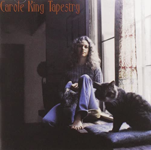
The arrival of Tapestry in February 1971 marked a transformative moment in Carole King’s career, offering a collection of songs that connected instantly with audiences through their emotional clarity and timeless melodies. Released on Ode Records and produced by Lou Adler, the album featured King on piano and vocals, with support from James Taylor on acoustic guitar, Danny Kortchmar on electric guitar, Joni Mitchell on background vocals, Russ Kunkel on drums, and Charles Larkey on bass. The record became a phenomenon, reaching number one on the Billboard 200, where it remained for 15 consecutive weeks and eventually spent more than 6 years on the chart. The cover, photographed by Jim McCrary, shows King seated in her Laurel Canyon home with her cat Telemachus near the window, a visual that perfectly reflects the intimacy of the music inside. The album produced enduring hits, including “It’s Too Late” and “I Feel the Earth Move,” both of which reached number one on the Billboard Hot 100, and it earned four Grammy Awards, including Album of the Year and Record of the Year for “It’s Too Late.”
# 7 – Hejira – Joni Mitchell

Hejira arrived in November 1976 as one of Joni Mitchell’s most striking artistic turns, shaped by the restlessness and introspection she carried through a period of heavy travel. Released on Asylum Records and produced by Mitchell, the album featured her guitar work and vocals alongside contributions from virtuoso bassist Jaco Pastorius, whose distinctive fretless tone became a defining element of the record. Additional musicians included Larry Carlton on guitar, John Guerin on drums, and Neil Young, who played harmonica on “Furry Sings the Blues.” The album climbed to number thirteen on the Billboard 200 and further strengthened Mitchell’s reputation for ambitious, literary songwriting paired with inventive musical architecture. The cover photograph, shot by Norman Seeff, with design by Mitchell and the art department at Asylum, presents the now-iconic image of Mitchell wrapped in a winter coat against a blurred highway, capturing the theme of movement that threads through the entire album.
# 6 – Captain Fantastic And The Brown Dirt Cowboy – Elton John

![]()
The world Elton John and Bernie Taupin built together never felt more alive than in Captain Fantastic and the Brown Dirt Cowboy, an album that painted their early struggles with the color and sweep of myth. Released on May 19, 1975, the record was shaped at Caribou Ranch in Colorado under the production of Gus Dudgeon, with Elton John joined by Davey Johnstone on guitar, Dee Murray on bass, Nigel Olsson on drums, Ray Cooper on percussion, and Del Newman providing orchestral arrangements. Its narrative depth is intertwined with the striking visual identity created by artist Alan Aldridge, whose intricate, dreamlike artwork expanded the album’s storytelling far beyond its grooves. The record entered the Billboard 200 at number one, carried by songs that traced the duo’s beginnings with both vulnerability and confidence, including the standout single “Someone Saved My Life Tonight.”
# 5 – Dark Side Of The Moon – Pink Floyd

![]()
The Dark Side of the Moon emerged in March 1973 and quickly became one of the decade’s most commercially dominant albums, reaching number one on the Billboard 200 and remaining on the chart for years. Its cover, created by Hipgnosis with George Hardie, features the now iconic prism refracting a beam of light into a rainbow set against a black background. The concept was chosen to reflect the band’s refined sound and stage lighting, and its clean geometric presentation became one of the most famous images in rock history. The simplicity of the prism, along with the precision of Hardie’s line drawing, defined a visual identity that has endured across generations.
# 4 – Sticky Fingers – The Rolling Stones

The arrival of Sticky Fingers marked a moment when the Rolling Stones reshaped rock culture visually as much as musically. Released on April 23, 1971, the album featured Mick Jagger, Keith Richards, Charlie Watts, Bill Wyman, and Mick Taylor, with production by Jimmy Miller. It topped the charts in the United States and the United Kingdom, driven by defining tracks such as “Brown Sugar” and “Wild Horses.” The cover, created by Andy Warhol, presented a close-up image of a jeans-clad torso and introduced a working zipper design that became one of the most famous pieces of album packaging in history. Photographer Billy Name provided the original image, while Craig Braun handled the physical design concept, resulting in a cover that perfectly matched the album’s attitude and impact.
# 3 – The Ramones – The Ramones

Raw urgency pulses through Ramones, the groundbreaking debut album released on April 23, 1976, which defined the aesthetic and attitude of American punk. The album reached number 111 on the Billboard 200 and introduced a stripped-down sound that reshaped the musical landscape. Its iconic cover, photographed by Roberta Bayley outside a graffiti-scarred brick wall on East Fiftieth Street in Manhattan, captures Joey Ramone, Johnny Ramone, Dee Dee Ramone, and Tommy Ramone in leather jackets and denim, forming an image inseparable from the band’s identity and the larger punk movement.
# 2 – Rumours – Fleetwood Mac
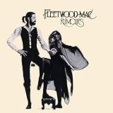
![]()
Few album covers are as immediately recognizable as Rumours, released on February 4, 1977, a record that rose to number one on the Billboard 200 and became one of the best selling albums of the decade. The cover photograph, taken by Herbert Worthington, presents Mick Fleetwood and Stevie Nicks in a theatrical pose that reflects the drama and artistry surrounding the band during the album’s creation. Worthington’s stark, minimal composition emphasizes their contrasting silhouettes, with Fleetwood’s wooden balls and Nicks’ flowing dress becoming lasting visual symbols tied to the mythic aura of the group.
# 1 – London Calling – The Clash
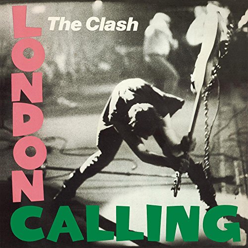
London Calling arrived in December 1979 with an album cover that instantly captured the rebellious force of The Clash and the era they helped define. Designed by Pennie Smith and Ray Lowry, the artwork features Smith’s now iconic photograph of bassist Paul Simonon smashing his Fender Precision bass onstage at The Palladium in New York City during the band’s 1979 tour. Lowry paired the image with typography modeled after Elvis Presley’s debut album, creating a deliberate visual collision between early rock and roll imagery and late seventies punk energy. The album reached number nine on the UK Albums Chart and earned widespread critical acclaim, while its cover became one of the most celebrated images in rock history.
Check out similar articles on ClassicRockHistory.com Just click on any of the links below……
Read More: Artists’ Interviews Directory At ClassicRockHistory.com
Read More: Classic Rock Bands List And Directory
25 Best 1970s Album Covers Of All Time article published on ClassicRockHistory.com© 2025
Classicrockhistory.com claims ownership of all its original content and Intellectual property under United States Copyright laws and those of all other foreign countries. No one person, business, or organization is allowed to re-publish any of our original content anywhere on the web or in print without our permission. All photos used are either public domain Creative Commons photos or licensed officially from Shutterstock under license with ClassicRockHistory.com. All photo credits have been placed at the end of the article. Album Cover Photos are affiliate links and the property of Amazon and are stored on the Amazon server. Any theft of our content will be met with swift legal action against the infringing websites.
![]()